Spacestation
Miriam Cadji visits the London office of Wells Mackereth – an architectural practice whose partners have vowed to inject personality back into interiors
Appropriately for a practice with a serious track record of industrial-chic refurbs, Wells Mackereth is based in a gutsy 100-year-old tailors’ workshop building in London’s Soho. Once inside, you are likely to be greeted with an effusive welcome from Max, Wells’ Portuguese water dog, who roams happily around the open-plan office.
Sharing the space are partners James Wells and Sally Mackereth, who met while working for Stanton Williams Architects. While the practice’s aesthetic suited them, they both hated the office atmosphere. ‘It was a very controlled, insular place – grey, turgid and dull,’ says Wells. He decided to make a move, and persuaded Mackereth to join him. ‘We just sort of clicked’, he explains. ‘We sparked each other off and swapped ideas really easily.’
In 1995, the duo had the audacity to set up shop together on the back of a single, small domestic job. As luck would have it, their timing was perfect – loft apartments were booming and there was suddenly a real market for smaller projects ideal for a young practice. Together they vowed to fight against the sterile brand of polite grey and stainless steel design they had left behind, and inject some personality into their work. The resulting style, which Wells terms ‘modern design, but with a bit more wow’ is still rigorous, but with some expressive touches, colour and texture peeking through.
Coincidentally, both Wells’ wife and Mackereth’s husband run their own successful PR companies, which would suggest a potential for serious hype, but the practice is surprisingly low key about its achievements. Wells dismisses the fact that the practice has completed six projects in the past four weeks as mere coincidence; ‘We don’t like to oversell ourselves,’ he says.
The duo seem to complement each other well: according to Wells, Mackereth is ‘a fantastic girl about town’, by contrast, he insists he is happier stuck in the office. ‘Sally and I are quite butterfly-minded and a lot of architecture is a slow chewing over process,’ says Wells. ‘Working on a project for three years wouldn’t thrill either of us.’ This restless attitude is reflected in the sectors the practice tends to gravitate toward – the fast-moving and immediate world of retail, bar and restaurant design.
The practice’s big break came in 2000, with the opening of Smiths of Smithfield, a huge bar and restaurant spread over four floors of a converted industrial building overlooking London’s meat market. Borrowing heavily from New York’s meat-packing district for inspiration, the gritty, yet polished, interior was designed on a shoestring. Accordingly, the practice worked with what was there, exposing the original brickwork, cast iron and steel structure and adding galvanised steel ductwork, raw concrete and reclaimed timber. Quirky flourishes alluding to the history of the area – coir matting that runs along a wall on the ground floor, and blood red PVC strips hanging down from the ceiling in the champagne bar upstairs – helped to create a strong identity.
Ultimately, its strength lies in this grown-up approach to having fun. As well as correct space-planning, the practice understands the importance of big gestures – getting the mood right with colour and lighting, and adding the intangible elements that go beyond the clients’ basic operational needs. Sidestepping wacky gimmicks or overt themeing, Wells asserts ‘We want the extra touches to be witty without being jokey.’
Its recent appointment by Pringle catapults Wells Mackereth into another league. The knitwear label approached the practice for help translating their new brand image (less Jimmy Tarbuck, more Robbie Williams) into bricks and mortar. What followed was a crash course in branding culture, as it was given just four-and-a-half months to create a flagship store and London HQ. With more stores planned around the world, Wells Mackereth has supplied a design manual so that its concept can be rolled out. One shop, in Tokyo, has already been completed with the help of an executive architect on site. ‘I understand it’s very nice’, smiles Wells, who confesses he has only seen photographs.
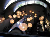
Closer to home, the practice has just completed the Tea Factory, a bar and restaurant housed in a former industrial building. The client, R and R Bars, had loved Smiths and wanted the same approach used for its site, a converted brick warehouse in Liverpool. Aiming to attract an ‘urban’ crowd, the finishes are left raw, and warm materials and colours are used to create contrast and intimacy in what is otherwise a cavernous space. Contemporary lanterns made from polycarbonate sheeting – a material more commonly used for factory roofs – glow yellow, and hang low over the walnut-clad bar. One wall is covered with tangerine coloured felt and a ‘wet-look’ polished poured floor helps to carry through the industrial feel. Faux authentic touches such as the ‘Tea’ sign in vintage graphics painted directly on to the brickwork behind the main bar and the abstracted map of tea trade routes which wraps around the stair, give the impression they were uncovered during strip out.
‘We added some fakey touches,’ Wells grins. ‘We can be a bit naughty – we like to invent a bit of history and pretend it was always there. I don’t have any qualms about introducing a little more character sometimes.’
Also fresh from the drawing board is Cafeteria, a bar and restaurant in Ladbroke Grove, west London. With a modest budget to work with, the practice has used a light touch to transform the former Belgo (designed by Foreign Office Architects in 1998) into a new venue for Smiths’ chef John Torode. The restaurant asserts its place on the high street with full-frontal glazing and a projecting diner-style neon street sign. Inside, the curved timber ceiling has been re-finished (it was too dominatingly yellow) and the huge, monastic dining area makes use of clever visual devices to create a more intimate environment. Oversized furniture – huge sculptural spun Fibreglass globes which shade naked lightbulbs; and a stretched pod made from lacquered MDF fins which holds banquette seating and a waiters’ station – help divide up the space and transform a rather large echoing cavern into a more buzzing restaurant.
The one sticking point was colour – the interior is deep petrol blue throughout and the team had decided to use fuchsia pink for the neon sign and to highlight certain elements. ‘We had just finalised everything when Jamie Oliver opened his restaurant Fifteen – we had to change it all because the client was worried everyone would think we’d copied him.’ At the 11th hour, the team switched its choice to duck-egg blue.
With so much bar and restaurant work under its belt, the practice takes its research seriously. However, late-night drinking sessions are getting trickier for the two principals. Both partners have toddlers and Mackereth has just given birth to her second baby, while Wells’ new addition is due this September.
Besides the existing sectors keeping the practice busy (a private members’ club is next on the agenda), the company is keen to diversify. Its ambitions lie in designing new buildings for the public sector in the UK and Europe, and with its knack for prototype light fittings and furniture, perhaps launch a retail range of its own.
Read this next

-
Post a comment


