Doomed BA tailfins fly high in my estimation
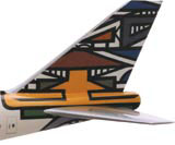
I was interested to see British Airways’ identity of 1997 held up as an example of failed rebranding (DW 21 April).
I was interested to see British Airways’ identity of 1997 held up as an example of failed rebranding (DW 21 April).
For me this rebranding was inspired. Yes, it did look much less like a British institution, and it did lose some of its traditional values, but that’s not necessarily a bad thing.
It was a ground-breaking approach within its industry, it was about a bright, global future, a future of success brought about through its true knowledge and understanding of its multinational, multicultural target markets.
It stood apart from the crowd, it was a more intelligent approach to branding and it was probably before its time. The radical look could have alienated some of its old target audience, but to me the positive aspects of it far outweighed the negatives.
The failure of such radical rebranding could be because its values are not lived throughout the organisation, but I believe in this case the world’s rejection was down to lack of vision (heavily influenced by Margaret Thatcher’s vicious and short-sighted damnation).
As creators of new brands or evolvers of existing ones, we must be aware of the pitfalls, but it shouldn’t stop us from challenging. After all, there are as many success stories as failures.
Chris Arden, Creative director, OTB, Leeds LS6 3BJ
-
Post a comment


