Dynamic duo
Top Shelf’s uncompromising formula has enabled it to build up quite a portfolio in a short space of time.
There’s a really old joke in publishing that goes, ‘You know how you make a small fortune in publishing? Start with a large one.’ Because, as anyone who’s ever been involved in producing books knows, it’s extremely difficult to make money in a business where the ends often don’t meet. So how has American graphic novels publisher Top Shelf managed to publish more than 100 titles in just eight years? The answer lies in the diversity of style, content, genre and feel of those titles, but also in the working style of the company’s co-publishers, Chris Staros and Brett Warnock.
In direct contrast to the current trend for overtly political graphic novels that deal with big themes – war, racial hatred, cultural expression, religious intolerance and censorship – Top Shelf’s output succeeds by focusing on the minutiae of everyday life and death, the emotionally huge themes that we all connect with.
In books such as Hello Again by Max Estes, Blankets by Craig Thompson, Jeffrey Brown’s Girlfriend Trilogy, Box Office Poison by Alex Robinson and The Mirror of Love by Alan Moore and José Villarrubia, the themes are alienation, loneliness, sibling rivalry, burgeoning sexual knowledge and bittersweet first love – plus, of course, the (quite literally) odd superhero in the case of David Yurkovich’s gloriously surreal Less Than Heroes.
But while Top Shelf’s catalogue is as broad in its themes as the artists are in style, there is a distinct house style to the publications, which share a design sensibility and cohesion that makes them beautiful objects as well as great books. This is rooted in a number of things. One is the ‘inarguable veto’ the two publishers gave each other when they set up the company in 1997; namely, if one of them doesn’t want to publish something, they don’t publish it.
‘As with many publishers, we publish more based on instinct than anything [else] – whatever feels right. Chris and I then have to agree together to publish every book, no matter who brings it to the table, or it doesn’t happen. For the most part, it’s really helped us keep a fairly focused line,’ explains Warnock. His obsession with how the book feels in the hand adds to this house style. ‘I have a print fetish that drives me to make things that just feel good, a tactile groovy vibe that feels “right”,’ he explains.
Unsurprisingly, Warnock has a design degree, which doubtless plays its part in Top Shelf’s obvious love of the books as a designed object, though he explains that while he supervises all the facets of production, his level of intervention in the design process varies enormously. ‘Often, a particular cartoonist might do all of the design, if I think they have the chops for the job at hand,’ he says. ‘Aaron Renier’s Spiral-Bound, due to be published in August as a tale of ambition, morality, and self-discovery in two-colours, is a good example.
‘The story gestated in several forms while Aaron worked out the story. Like writers often do, in writing several rounds of a manuscript, he also slowly developed a style that he felt suited the story. The cover also went through several revisions until we were all satisfied with the whole,’ recalls Warnock.
With other publications, Warnock is more hands-on. ‘I’ll take a kernel of an idea from one of the cartoonists – a sketch, a painting, or just some verbal cues from their work – that will inspire an idea,’ he explains. ‘Occasionally, inspiration hits immediately, fully crystalised, and oftentimes I’ll need to let the ideas ferment.’
Liz Prince’s first solo full-length comic, Will You Still Love Me, saw Warnock work with the author on developing suitable illustrations to work from, then he started the design process from scratch. ‘But just as every author needs an editor, so too does an editor themselves. By this I mean that the first round of design I made for Liz’s book was vetoed by both Liz and Chris. They were, of course, correct in their assessments of my work, so I changed my tack and came up with a better scheme all around. My main goal is to service the meat of the story or conceit with a design that will appeal to a potential reader, and yet not call attention to itself for the sake of frivolous design,’ he explains. It’s not an easy task. ‘In a way, designing the book that originates from the fevered imagination of someone else can be tricky, and can be compared to what the person who designs a film title is to the film-maker. They are two totally different skill sets. Everything ultimately needs to serve the story, and both parties involved inject their own vision, often make compromises, find a common ground and birth the baby,’ he explains.
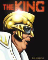
Judging by the spring and summer catalogue, Warnock and Top Shelf are continuing to find just the right balance in both design and content. Aside from Spiral-Bound and Will You Still Love Me, there’s also Rich Koslowski’s The King, a mystery novel about an enigmatic Elvis impersonator called Mosquito. It is drawn entirely in red ink by Dan James who, having broken his right arm, decided to use his left to construct a wordless, modern-day Nosferatu vampire tale. And then there’s the final part of Jeffrey Brown’s so-called Girlfriend Trilogy, AEIOU, which explores the subtleties of relationships.
Where does such diversity come from? ‘Mostly, we just love comics and good stories. But I hope that we’re seen as someone with good taste who takes risks in an effort to get really good comics out to an ever expanding and hungry audience,’ concludes Warnock.
-
Post a comment


