Interbrand designs branding for new .art domain
The design consultancy has created a “minimal, flexible” visual identity for .art – a new web address which has been created to establish an online creative community.

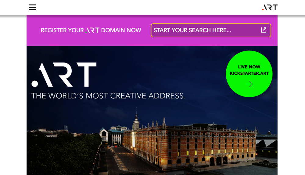
Interbrand has designed the branding for .art, a new online web address dedicated to arts and cultural institutions worldwide.
.art is owned by company UK Creative Ideas, which signed an agreement with the Internet Corporation of Assigned Names and Numbers (ICANN) last year to create the domain. It will sit alongside domains such as .com, .co.uk, .org and .ed.
Establish a creative community
It has been launched to establish an online global creative community, UK Creative Ideas says, for art and technology groups of all disciplines, including museums, fairs, organisations, galleries, foundations, collectors, curators, companies, agencies and individuals.
It will enable creatives to showcase their work, but will also give “the arts a business setting”, says Interbrand executive creative director Sue Daun, in a similar way that .org is used for charity organisations and .ed for educational institutions.
The domain launched last week, and the Louvre Museum, Sotheby’s, Apple, Disney, Facebook, Google, Microsoft, Chanel, Rolls-Royce and Beyonce are among those which have joined so far.
“Minimal, flexible” branding
Interbrand’s visual identity for the platform is “minimalist” and “flexible”, says Daun, with the aim of showcasing members’ work as the focus point.

The logo consists of a dot which changes in colour, and a minimalist form of the word “Art” created in a bespoke typeface. Secondary typeface Bague Sans Pro is used throughout the visual identity, alongside a rectangular symbol which changes colour. This is used to frame imagery, photography and project work of the member organisations.
“We didn’t want to impose our identity on the art,” says Daun. “It’s a signature that will sit alongside it. It had to be adaptable to every collection. What you leave out is as important as what you put in – much like art itself, it was about knowing when to stop.”
A colour palette was whittled down from 360 shades to seven, including black and a series of “vibrant” colours. This is used for the dot symbol in the logo and the framing device.
“This palette allowed us to sit the logo in different scenarios so it complements the art, not goes against it,” Daun says. “We wanted the photographs to have a strong sense of place.”
Visual identity will constantly change
The logo and framing device will be used constantly across visual communications but the imagery will regularly change as the .art organisation grows and gains new members, says Daun.
“There are fixed elements and elements that change,” says Daun. “The art world constantly changes, as will the mediums featured, from sculpture to books, paintings and projections on buildings. This will keep the identity really fresh.”
The branding has rolled out online, and will continue to roll out on print advertising and communications.
Individuals and collectives can apply to have a .art web address from May 2017 – but there will be a “stringent” process of “authentication” when applying for the domain, says Daun.


So near yet so far. Why oh why did they not line up the diagonals on the A and R
Very great point Stephen. It would flow very well with that small tweak.
Could not agree more, jumped out at me too. Are we missing something?!
Very cool idea. Simple but clear, that is the direction.