OkCupid focuses on “more substance than selfie” with app redesign
The dating site’s in-house design team has done away with Tinder-style features and commissioned designer Jay Daniel Wright to create a series of colourful illustrations.

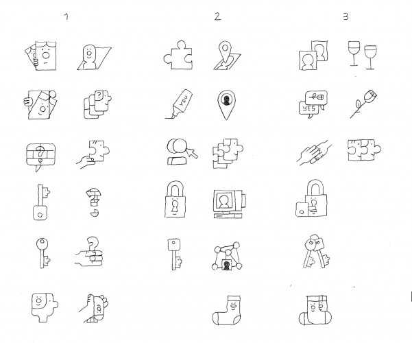
Update 17 March 2017: OkCupid’s redesign has now fully rolled out across its app and website, with the dating site also revealing a suite of new visuals. See below for the full selection.
OkCupid has revealed its redesigned app, which looks to differentiate itself from rival dating sites with a “quirky” illustration-driven look and new features that highlight people’s personalities.
Designed by OkCupid’s in-house design team, the refreshed app features a new typeface, simpler user interface design and illustrations by Berlin-based designer Jay Daniel Wright.
“Quirky, niche and weird”
“OKCupid was interested in moving away from a safe and generic vector style,” says Wright. “The focus was on individuality and the quirky, niche and weird.”
The colourful illustration style is based on the concept of “celebrating difference”, adds Wright, with character traits ranging from “artsy” to “chill” all being highlighted.
The app has been redesigned to reflect the fact that its users are “more substance than just selfie”, says OkCupid.
New features
Its Tinder-style “Quickmatch” feature has been replaced with “DoubleTake”, which shows more of the users’ pictures and personal interests than before.
OkCupid has also added to the existing questions users are asked to fill in when they set up their dating profile with 50 “of-the-moment” questions for 2017, covering topical issues ranging from Donald Trump to student debt.
The new questions and DoubleTake features are now both live on the app, with the refreshed look set to roll out across the app and browser website in March.


Latest visuals


-
Post a comment


