
DixonBaxi gives Regent’s Place a brand to celebrate “radical softness”
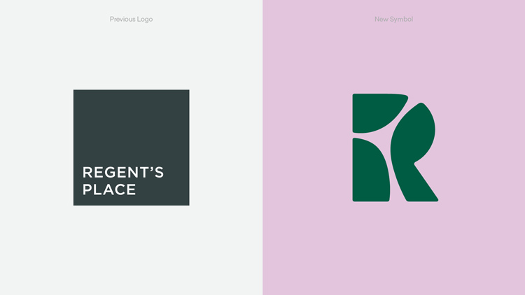
The identity for the neighbourhood centres around a graphic “R” logo, which the studio says is designed to “almost disappear” when applied.
DixonBaxi has designed the new brand identity for Regent’s Place, a neighbourhood currently being regenerated in central London which will include offices, shops, restaurants and homes.
The new look, which will be used across communications and physically within the area, is focused on the idea of “responsible urbanism” and looks to position Regent’s Place as a place where “people and planet thrive”.
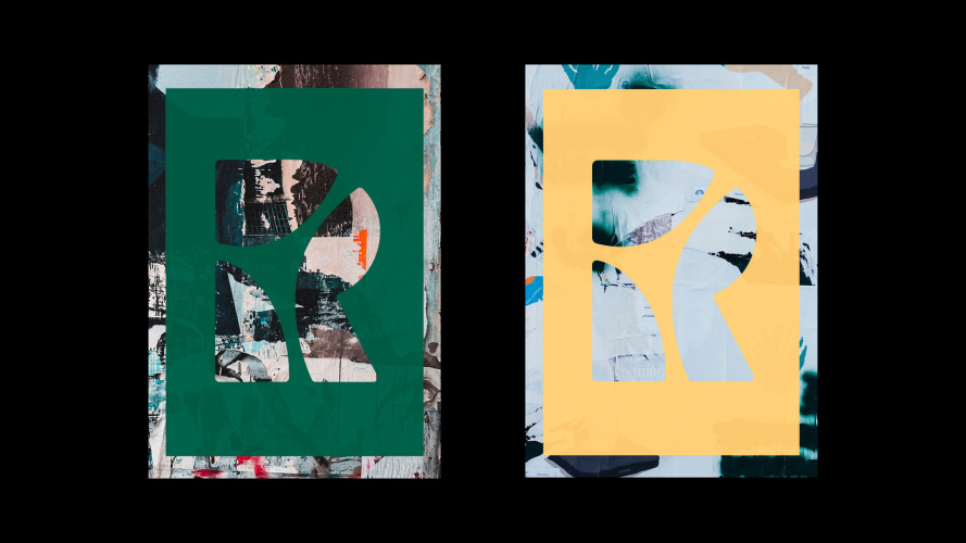
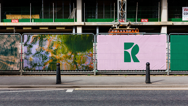
The centrepiece of the project is a graphic “R” logo, which gives a nod to the geography of the site. This is supported with an “editorial visual language”, an “understated” tone of voice and a “natural” colour palette, as well as various in situ assets like posters, wayfinding and business cards.
“Responsible urbanism”
DixonBaxi was involved in the project because of an ongoing relationship with British Land, the property development company behind the area. The brief given to the studio was to create and define a new position for Regent’s Place which felt more integrated with the surrounding community, and paid attention to this idea of “responsible urbanism”.
This is, according to senior DixonBaxi designer and lead creative for the project Astrid D’Hondt, contrary to more traditional branding for real estate neighbourhoods.
“Climate, economic and technological shifts are moving faster than ever, greatly impacting our environment, communities, and businesses and people are looking at brands to provide solutions to societal needs,” she says. “The place and the brand aim to redefine the role of real estate in a world of changing work trends, social inclusion agendas, and environmental responsibility.”
The aim, D’Hondt adds, was to create a place people would be “proud to associate with”.

“A space to tell a story”
The design of the central “R” logo is inspired by the three districts that intersect at the site of Regent’s Place, D’Hondt tells Design Week.
These are the Knowledge Quarter, which she explains has an “inherent implication of intelligence”; Camden, “with its implicit creativity”; and the West End, which has a “reputation for style”.
The logomark itself, the studio says, has been created to “almost disappear”. Across different applications it serves the role of a framing device, which DixonBaxi says provides “a space to tell a story”. In addition to the static logo, a set of 3D idents has also been created.
In a bid to bring elements of the previous identity into this new iteration, D’Hondt explains that the logo has been silkscreened on top of old posters and tote bags. This was, she says, “a nice way to signal change and involve the local community”.
A “calming experience”
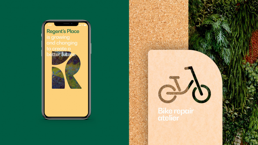
The rest of the brand identity has been created with a “radical softness” in mind, the studio says, which uses the natural environment in “every aspect of design and behaviour”.
“All choices promote ecological integrity, engagement and inclusive participation”, the studio explains, with examples including reclaimed wood being used for signage totems around the neighbourhood, air purifying paint included throughout and soy-based inks used for posters.
This is supported with an editorial visual language which aims to create a warmer, human feel that uses softness “with confidence”. Organic lines and natural colours are two examples the studio gives of this softness, saying that this offers a more “calming experience” of the brand.
“The long-term thinking of the neighbourhood”
As D’Hondt explains, one of the main challenges of the project came from the fact the area is still under construction.
“[We had to] balance the ambition Regent’s Place has for the future with the reality of a place that is still under development,” she says. Branding needed to “express the long-term thinking of the neighbourhood”, she continues, without diverting away from the reality of what visitors can currently find at the site.
The fact that the site is not yet complete is also one of the reasons DixonBaxi is continuing work with the project, with the aim of creating an “ever-growing” content library as things develop. In the future, this will likely include the likes of photography, interviews with business owners and films that offer “an authentic perspective”.
Read this next

-
Post a comment


