Nissan reveals new logo for the “digital world”
The company’s first new logo in 20 years was created by an in-house design team and looks to embrace both physical and digital platforms.
Nissan has revealed its first new logo in 20 years, which looks to connect the brand’s “rich heritage” with a digital future.
The Japanese car company revealed the logo, along with a new model of electric car, at a “digital world premiere”. In a statement on its US website, the company detailed the design process and outlined the uses for the updated brand identity.

The design process

In 2017, Nissan senior vice president of global design Alfonso Albaisa began work on Nissan’s logo and brand identity. Albaisa set up a design team led by the deputy general manager of Nissan’s advanced design department Tsutomu Matsuo. The team was led by three keywords: thin, light and flexible.
A two-year design process followed. “Inspiration was drawn from breakthroughs in science, technology and connectivity – how these have brought fundamental changes to customers,” Albaisa says. “As you can imagine, visions of digitalisation started swirling in our heads.”

Part of the design challenge was taking variables of different vehicles into account. The logo is to be illuminated on electric vehicles, for example. This meant the team had to work out the thickness of the logo’s outline “to ensure a crisp impression when lit” as well as considering government regulations for cars’ illuminated features. The logo also needed to make a “strong impression when not illuminated” like when it is used on more traditional formats like paper.
The company is detailed about the design process: the logo design started in 3D and was then developed in 2D. The illuminated badge was created first and the lit-up area was then used to create the 2D form of the badge.
“More designed than manufactured”

The previous logo was inspired by Nissan founder Yoshisuke Aikawa’s mantra: ‘if you have a strong belief, it penetrates even the sun’. The logo’s circular design featured a horizontal plate with the company’s name. Nissan says that it was a priority to retain this belief, and so the new logo’s core elements are familiar.
The result is a flat design update, in line with BMW’s hotly-debated new logo and Volkswagen’s updated design from last year. And like Volkswagen, Nissan also announced the design update with the reveal of an electric vehicle. The Ariya is the company’s “first all-electric crossover SUV”.
On the Ariya range, the new logo will be lit by 20 LEDs, which is a nod to the number of years between logo redesigns. Nissan has confirmed that the new logo will be used on other vehicles in the coming years as the “new chapter of Nissan evolves”.

Nissan calls the new two-dimensional look “more designed than manufactured” and claims it has “the flexibility to live in multiple worlds”. It hopes that the redesign takes the identity from a “hard-edged, industrial feel to a refined, familiar and digital-friendly look”. It says that the new logo symbolises “the company’s dedication to keep innovating for new generations of customers”.
Logo roll-out

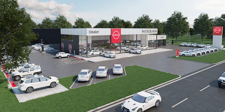
The new logo rolls out from July, in both digital and physical platforms. It will first appear on the new electric vehicles, followed by a wider roll-out. The company lists letterheads, dealership signs, social media and digital advertising among these. It is hoped that the four iterations of the logo will be able to flex across all these uses.
One aspect of this will be for digital communications, where the logo can “reflect today’s ever-changing environment” by using different backgrounds. In a promotional video for the launch entitled A New Day for Nissan, the new logo appears in a variety of natural settings, from cherry blossoms to crystalline formations.
What do you think of Nissan’s new logo? Let us know in the comments below.


It took a team of people three years to produce that?
I think they have done a cracking job! To design something that needs to be digitally lit but also legible when not lit, sit well on a something tradition such as a letterhead, work on the web, work on printed collateral. Its a mammoth task!! and I think they have nailed it!
I love it when you see comments like Tom’s “a child could have done this.. or it took a team of people how long to design that”… this is a global brand, not a logo for a Cornish pasty shop. It has to be right first time and work across all mediums, so yes I imagine a team of people taking 3 years seems perfectly reasonable.
Well done Nissan for designing their new logo.
I can see how the new flat design gives the logo freedom to be used in digital and traditional channels, and its simplicity removes any unnecessary aspects that didn’t add value to the old design.
However I do partly agree with Tom’s comment. I understand rolling out a logo across the globe for a huge company like Nissan can take a long time but I was surprised reading near the start of the article it was “A two-year design process…”.
This is likely due to my lack of knowledge and I would be interested to hear if this is time scale is common for large companies?
@James
I’m not naive enough to say anything as presumptuous as “a child could have done that”. I have worked on huge brands such as Toyota – so from actual experience I know that this is a very long time to spend on something that should have been completed in around a year to eighteen months. To me (and any experienced designers out there), a flat logo was the only option that could have ticked all of the boxes to work across digital, video, print and physical. I’m just genuinely surprised that they took this long. Thanks for the insulting response though James.