Monotype transforms TfL’s London Underground Johnston typeface
Updated typeface Johnston100 includes two new weights and symbols used on social media, including the hashtag and “@” sign.

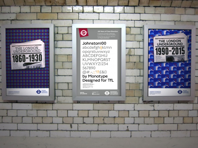
Monotype has updated Transport for London’s (TfL) iconic typeface to coincide with its centenary, featuring new hashtag, “@” and ampersand signs.
The new typeface, Johnston100, comes a century after Edward Johnston’s original designs were introduced on London Underground, and almost 40 years after consultancy Banks & Miles brought in New Johnston, adding two new weights and accompanying italics for the full set.
Johnston100 will be rolled out next month. Keep an eye out for it on printed materials, such as Tube maps and posters (limited edition prints are available to buy from the London Transport Museum shop).
To be used across TfL’s trains and station signs
Over time, the typeface will be used across TfL’s trains and station signage, including on London’s new Crossrail Elizabeth line when it opens in 2018.
The typeface better reflects TfL’s role in the digital age, according to head of design at TfL, Jon Hunter.
“We didn’t want a redesign, but we did know that certain things had changed. As social media has become more important, hashtags and ‘@’ signs are more important – Johnston never designed those because they were never needed. Mainly we wanted to make Johnston relevant and fit for today’s purpose,” he says.
Two new weights added
Over the last 100 years, Johnston became narrower and more mechanical as functionality took precedence over design. Monotype has opted for a wider face, which better reflects Edward Johnston’s original drawings and gives it more of a relaxed feel.
Two new weights have also been added – hairline and thin. “It was very important to TfL that we add the extra-thin weights, because of today’s digital trends,” says Nadine Chahine, UK type director at Monotype.
“We were able to capture the contemporary trend and the fashion of having something very light and very elegant, but because we are still using the original structures, we were able to maintain the soul of the typeface.”
18-month programme put on by TfL
The updates to the Johnston family coincide with an 18-month programme that TfL is running until December. This includes an exhibition called Designology currently running at the London Transport Museum that looks at how the transport system has evolved over the last century and an installation commemorating Frank Pick, the former managing director of London Transport who transformed it into a design-led organisation in the 1930s.


-
Post a comment


