SomeOne helps Personal Group “work happy” with rebrand
Employee benefits and financial services company Personal Group has been rebranded around a happiness concept, which looks to tie together products and services.

Employee benefits and financial services company Personal Group has been overhauled by SomeOne, which has rebranded the company around the theme of happiness.
Personal Group has been working on the likes of insurance, cash plans and rewards for 30 years.
One of Personal Group’s products is an employee engagement platform called Hapi, which allows employees to track, tailor and use company benefits from their mobiles. It means employers can have a closer relationship with each of their employees, using the platform as a direct channel to manage everything from communications, to payslips to HR.
SomeOne has used this as the inspiration for the rebrand on the understanding that “happiness and productivity” are linked.
SomeOne partner Simon Manchipp says: “For large-scale, geographically spread organisations like the NHS or OCS, technology like Hapi is becoming increasingly valuable.
“So people feel more valued – and more happy – if benefits are clearly explained through personal interaction and tailored to things they like and that they can redeem easily, through digital delivery.“
SomeOne coined the phrase “Work Happy” as something that distills the core idea of the company’s products.
The new identity system has ben designed to align the various sub-brands, platforms and divisions that the group uses.
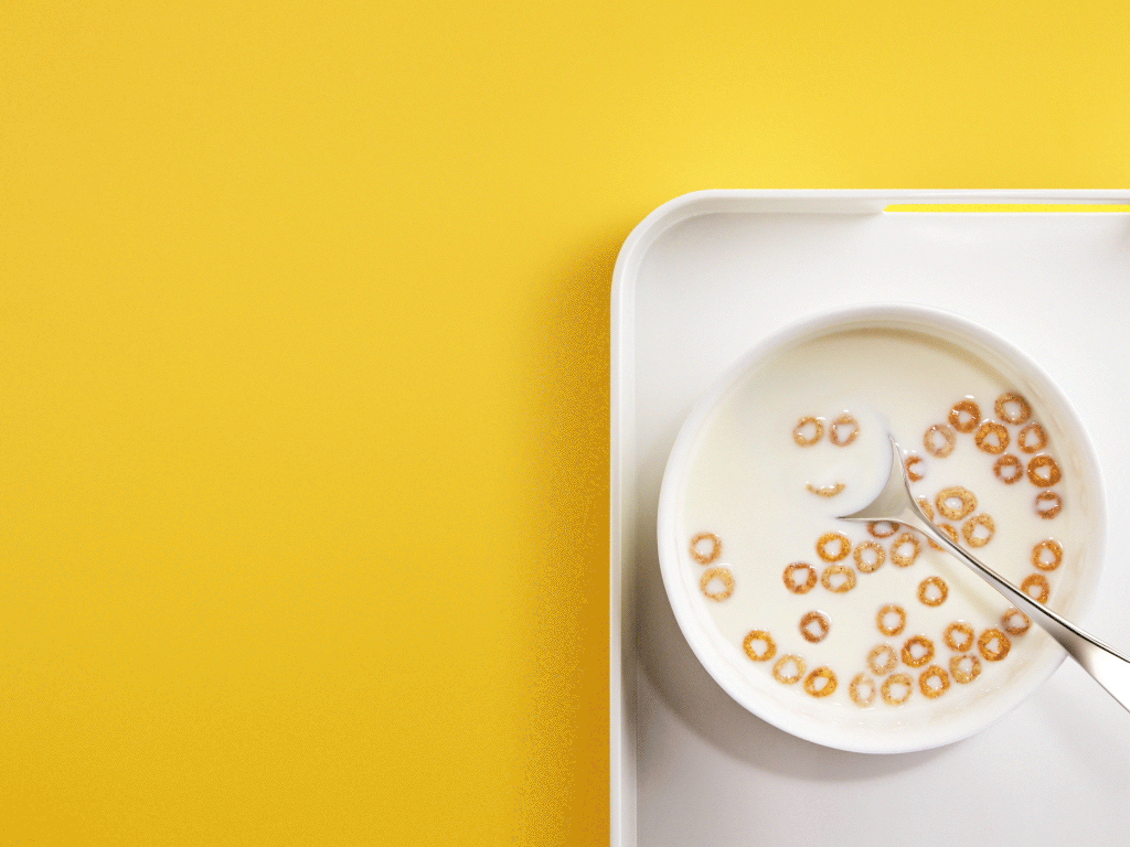
SomeOne developed branding based on a smiling face together with a “positive golden yellow palette”. Yellow is not only the most attention grabbing colour, according to the consultancy, but is also the colour most associated with happiness.
SomeOne design director Lee Davies says: “We knew that if we were going to recommend a smiling face, it had to be something a bit special.
“When we pointed out how a nose is formed from the lower case ‘g’, no one on the client side had spotted it straight away — much like the hidden arrow in the FedEx wordmark — so it was an added and pleasant surprise. It gives the ‘PG’ a more personal face.”
The smile becomes an “integral part of the brand world for PG”, he adds, appearing also in the word mark for Hapi, and as an ownable element in an extensive icon library for the different services.
Digital agency ELSE has helped to redesign Hapi and ReedWords has worked on the “happy” tone of voice across PG products.


-
Post a comment


