Tuborg reveals “youthful” brand refresh
The lager brand’s refreshed visual identity has been designed by Turner Duckworth and looks to target young adult drinkers, particularly in markets across Eastern Europe, Russia and Asia.

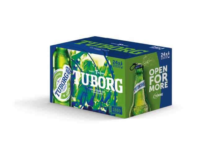
Danish lager brand Tuborg has unveiled refreshed branding, which looks to appeal to a younger audience of lager drinkers.
Designed by London and US-based brand consultancy Turner Duckworth, the refreshed visual identity is the brand’s first update since 2012 and aims to look “more youthful” and “dynamic”, says Tuborg.
Turner Duckworth has updated existing elements of the brand identity, replacing the black logotype with a brighter electric blue colour.
Crown and hops symbols
While the crown and hops symbols seen in the previous branding have been retained, these elements and the rest of the logo are flatter, less three-dimensional, and there is no shadow on the logotype.
The bright blue colour palette seen in the updated logo has been carried through to other elements across the identity, packaging design and communications in order to “stand out among the green beer brands” seen on supermarket shelves, says Tuborg.
“There are so many green beers, so we had to work on colour,” says Turner Duckworth joint chief creative officer and CEO, Bruce Duckworth. “The electric blue really came from Tuborg’s equity in music. It’s a very energetic colour, and it’s very distinctive.”
“Power pulse”
A tinted electric blue colour treatment has been applied to the brand’s photography assets, which Duckworth describes as a “simple, flexible way of bringing the brand together”.
Different sized blue ring shapes now surround the logo. They are designed to look like a “power pulse” to represent “the beat of youthful energy”, as a reference to the brand’s partnerships with music festivals.
A new “heritage stamp” featured on the packaging, which reads “Enjoyed since 1880 Copenhagen”, looks to reinforces the brand’s European heritage and tradition.
Global roll-out
Tuborg says it is particularly looking to engage with young adult drinkers in key growth markets in Eastern Europe, Russia and Asia, and highlights its role in bringing “Western music” to new areas such as Eastern Europe through Greenfest, its annual series of rock events in the region.
Turner Duckworth’s new designs for the lager brand will roll out alongside a new marketing campaign and a brand film created by Happiness Brussels, called “the beat through time”.
The refreshed identity will appear on all bottles and cans, multipacks, digital platforms, communications, in-store displays and other merchandise, and is rolling out globally this month.


Read this next


Remember drinking this at The Exit Festival in Serbia about 10 years ago. Dreadful beer.