Marina Willer rebrands Belgian cultural giant, Opera Ballet Vlaanderen
The ballet and opera house is the largest cultural institution in Flanders, the Dutch-speaking region of Belgium, and has taken on a new typographic logo that represents how performance art is constantly in flux.

Pentagram partner Marina Willer has rebranded Belgian cultural institution, the Opera Ballet Vlaanderen (OBV), with a new identity inspired by movement.
The OBV is based in Antwerp, which is in the Dutch-speaking, Northern region of Belgium, otherwise known as Flanders or the Flemish region. Other cities in Flanders include Brussels, Ghent and Bruges.
The cultural institution, which is the largest in Flanders, was founded in 2014, when an existing opera house and ballet company merged, and now operates as both a theatre and a touring company, putting on dance and opera productions.

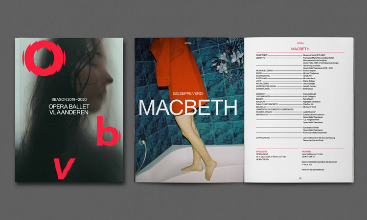
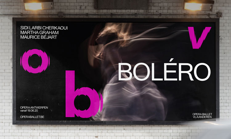
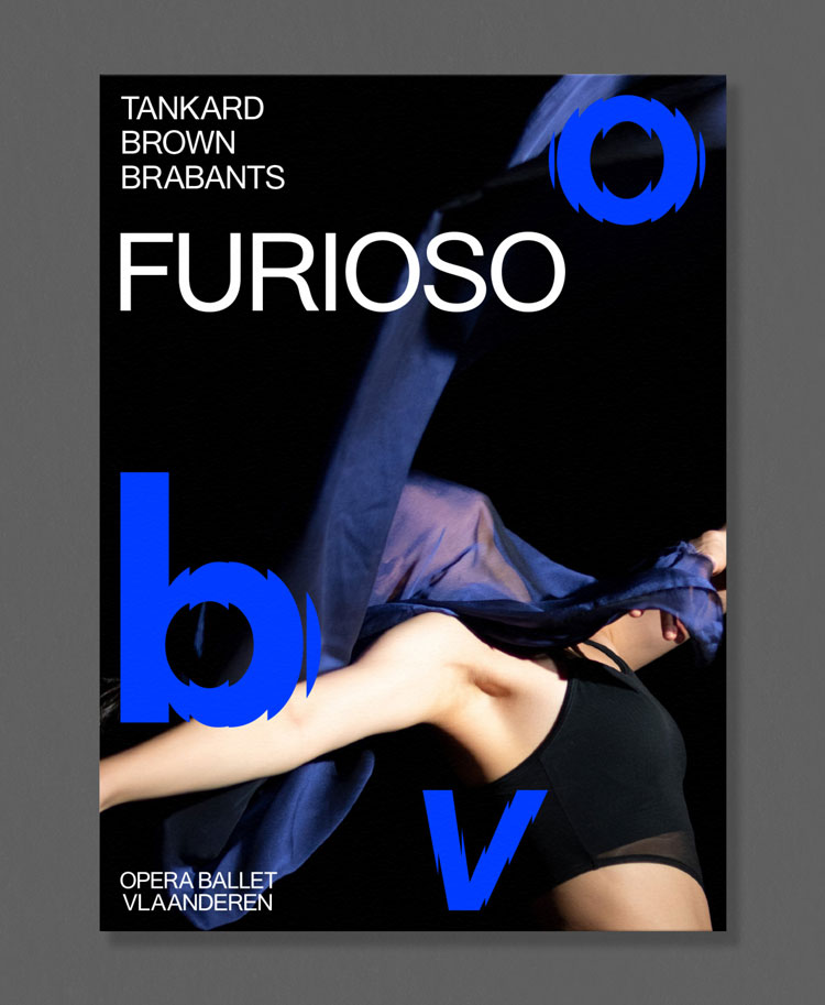
Willer’s team came up with the acronym for the company, OBV, which is now used as the main application of the logo. The three letters are set in a bespoke, sans-serif typeface that uses a ripple effect to imply movement, and are set in various bright colours, such as blue, orange and purple. They are then separated and scattered around when used across different touchpoints, such as marketing posters.
The full name, Opera Ballet Vlaanderen, appears alongside the acronym, set in sans-serif typeface Peace, and set much smaller and discretely, in white. Peace is also used as the supporting typeface across the identity.
While the acronym takes on different colours, this is coupled with photography that is abstract and often blurred, and features muted tones of grey, beige, black and white. Willer says the imagery aims to be “open for interpretation” and feel contemporary.

Willer says that the bright acronym logo aims to show how “every performance [at the OBV] is a different experience to both audience and performers”, and through its undulating effect, reflect the physical movement of actors on stage, and how “arts and culture are in constant change”.
“While built around typography, the new visual system is designed to express movement and transformation and embrace the transitory nature of performance art,” she says, adding that the brand concept is “never the same”.
She says the colours used in the logo aim to be “young and energetic”, and have been inspired by palettes used by Flemish artists and designers, such as Jean Fouquet and Marcel Boothaers.
Willer adds that the studio felt it was important to retain the full name of the institution to pay homage to its Flemish roots, while using the acronym makes it decipherable to a global audience.
“Using Flemish language for the name was key, as they are ambassadors for the region’s cultural scene,” she says. “But the full name is hard to remember for non-Flemish audiences, so the abbreviation makes it easier to recognise for people outside of the region and allows the company to connect with its international audience.”
OBV’s new branding has now launched across its website and social media. It will continue to roll out in the coming months across other collateral, such as its 2019-2020 season programme, marketing materials and merchandise.


-
Post a comment


