The Story of The Face: how the cult magazine changed British culture
As a new book is released documenting the rise and fall of youth culture magazine The Face under founder Nick Logan’s stewardship during the 1980s and 1990s, we speak to the author Paul Gorman about the enduring impact of the publication.

Design Week: Tell us about your own background and how the book came about?
Paul Gorman: I’ve been a print journalist for many years, working on trade papers throughout the 1980s. I was always an avid follower of music and fashion, but was very much an observer. I was logging everything that was going on, and one of the ways I did that was through The Face, which on a monthly basis brought information on the developments across youth and wider culture in terms of art, architecture, design, fashion and music.
By the early 2010s I’d written several books about music and fashion that made reference to The Face, and curated exhibitions that mentioned the magazine. But come the early 2010s its significance was in danger of being lost, following its founder Nick Logan selling it in 1999. Because magazines from that era like i-D have survived into digital age and become multi-platform, people understand them. But I gathered from talking to young people that they didn’t really understand The Face because they hadn’t seen copies of it, so there was a missionary element when deciding to write the book.
I also think that Nick Logan is probably the greatest print publishing magazine editor of the post-war period. In 2012, I went to an exhibition at the Victoria and Albert Museum (V&A) called British Design 1948-2012, which was really the thing that triggered the book. It had all the people you think of in British design, whether that’s Terence Conran, Neville Brody, or Jamie Reid. They were all in there and Logan wasn’t, so I thought fuck, this is a really important magazine that needs to be understood.
DW: How have you approached bringing the book to life?
PG: After doing a lot of research over the course of five years, I had several approaches that I knew I didn’t want to take. One being that I didn’t want it to be a compendium, where you get a bunch of covers, an essay or two and it’s all very froo froo. I’m a trade journalist so I was trained to be a sceptic, not a professional enthusiast. I wanted to investigate the proposition “The Face was really important”, and ask “why, and in what way?” I wanted to give it a critical appraisal, which is antithetical to the way The Face was. Getting one of the designers from The Face to design the book would have been a mess. The way we did it with the designer Therese Vandling was to present it in a cool and collected way so that it was very un-Face like, because there’s already enough going on in those spreads.
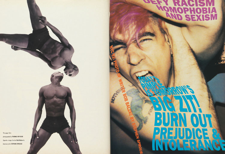
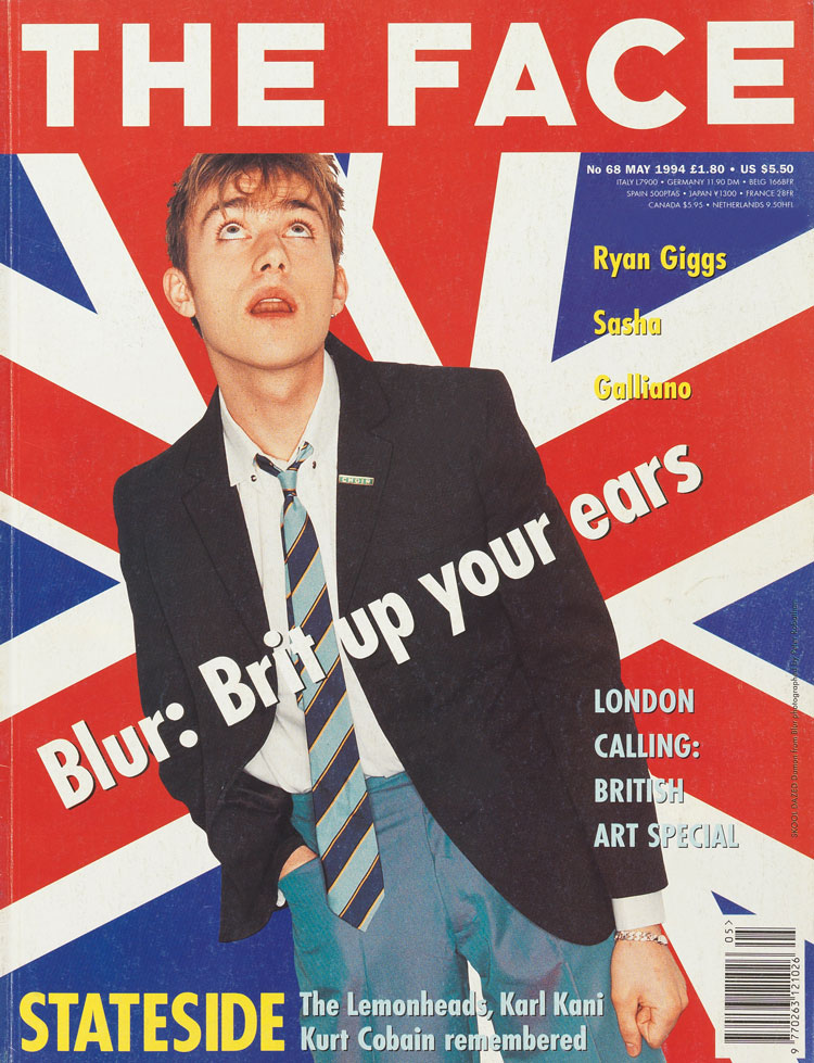
Another key thing that I wanted to do was make it equally balanced between the 1980s and 1990s, because Logan launched it in May 1980 and sold it in July 1999. The book is quite binary in a way, for example the first phase in the 1980s shows how graphic design had primacy at the magazine under the art direction of Neville Brody. Then when other art directors took over later they were more interested in the photography that was being made by young photographers, particularly in the fashion field. Also, during the first phase the accusation was that the magazine was too cool for school, whereas in the late 1980s it became much more inclusive. The first period is about urban elites, while the second part is about the revenge of the suburbs, provincial pride, and the rise of Manchester.
DW: Why do you think The Face had the impact it did on youth culture and British identity?
PG: It was one of those extraordinary publications that not only recorded what was going on in culture, but also played a part in progressing it. When it was at its best it was absolutely mandatory to buy it, because it was the news about what was going on. It also delivered this information in a very sophisticated way. The magazine was always produced very professionally and the paper was very glossy, unlike previously when the music press had just been printed on what was essentially bog paper. Logan built a place where people who excelled – whether it was in journalism, photography, styling, or graphic design with people like Brody – were all exemplars in their field. They naturally gravitated towards The Face, and then Logan nurtured them in the right way.
DW: How would you describe the design aesthetic of the magazine, and particularly Neville Brody’s vision for it?
PG: Brody is such an inventive, innovative and provocative designer that he made the visual language of The Face, which became one of the languages of the 1980s in design terms. Brody had grown up during the punk period, and trained at the London College of Printing, but he was really interested in being anti-corporate and a lot of his work was influenced by early 20th century avant-garde movements such as Bauhaus and Constructivism. He realised that he wouldn’t rip them off, instead he would channel their approach, because it was also anti-corporate and anti-establishment. He was given the license to do this because Logan gave him the space to pursue his design world. He allowed Brody to come up with a different series of fonts for every issue over 12 issues, where he manipulated and distorted them. This made it a very exciting read, because you had this mutating publication in front of you, and you wanted to see what they were going to do next.
DW: What role did the design of the magazine play in its influence?
PG: Serially, it set the pace for magazines, not least in their format. Logan found out the widest a publication could be on the magazine rack and got his printers to produce it in that size. If you worked for a big company you would have had to go through committees, whereas Logan just said “ok, we’re going to be in this size now”. Within a couple of years both The Sunday Times and the Observer supplements had adopted that size as well. You also very, very quickly saw that businesses understood this was an amazing way to communicate with young people and sell things. You had banks, holiday companies, everyone who was trying to get at the youth market adopting The Face’s design approaches. The way in which fashion was styled in the magazine became the way to style fashion. There were roughly 100,000 people reading it, and a large part of that audience was likely to contain a lot of decision makers and tastemakers, who would’ve then gone to their clients and said “this is a great look”. That’s why I called it “the magazine that changed culture”.
DW: The Face is part of the Design Museum’s permanent collection – why do you think it is important to preserve pieces of design history like this?
PG: The 230 issues overseen by Logan reside as a record of the tumultuous period of change during the 1980s and 1990s; not just of youth culture and pop culture but the wider culture, politics, media and communications. They month-by-month, wittingly catalogued what was happening. It is an enormously useful resource, which my book in a small part tries to convey. Those issues in the Design Museum are there as a permanent record now, and an assimilable record as well. It’s not dry as dust stuff that you have to keep your eyelids open with matchsticks to go through. This is living, popping culture, which has been recorded in a fantastic way.
The Story of The Face: The Magazine That Changed Culture costs £34.95 and is available from Thames & Hudson.


-
Post a comment


