Showing the way
How do you go about designing a system for guiding visitors through renowned buildings, using signs that are easy to follow and don’t detract from the spaces? Trish Lorenz finds out
Creating a signage scheme that effectively directs visitors through a complex space is no simple task. The job becomes significantly more complicated when designers are faced with an architecturally challenging environment. The difficulty can be to deliver schemes that do not damage historically significant spaces, as in the case of the Cabinet War Rooms. Another type of challenge is to complement creatively demanding buildings, such as the Scottish Parliament’s new home or the hallowed halls of the Museum of Modern Art in New York.
Scottish Parliament buildingsClient: Scottish Parliament
Design consultancy: CDT Design
Access consultant: Buro Happold
Manufacturer and wayfinding consultant: Wood and Wood
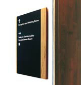
Designing and implementing an accessible wayfinding system for the controversial new Scottish Parliament, which opened in October 2004 in Edinburgh, was a three-year project for CDT Design. Today, more than 900 signs direct users around the space.
Divided between three interconnecting buildings, the site layout is complex, creating a need for a clear and definitive wayfinding system.
The group’s challenge was twofold. First, the nature of a parliament makes accessibility a prime necessity. There was no thought of creating a two-tiered system, with some signs specifically designed for certain disabilities, so the requirements of a wide user group are met by all items.
External signs feature a directional relief for visually impaired users to touch and all the key areas are signed in three languages – English, Gaelic and Braille. The challenge lay in ‘drawing a firm line between accessibility and visual intrusion’ and avoiding over-signing, says CDT creative partner Neil Walker.
The second, more creative, challenge was presented by architect Enrique Miralles’ vision for the building. The style of the system should emulate Miralles’ architectural ethos and each individual item has a slight curve, echoing the structural detail of the building.
There was also the need to strike a balance between the traditional gravitas associated with a parliament and the playfulness of the building. In public areas, primary signs are made from oak and powder-coated steel. To provide delineation, in functional areas the oak is stripped away and replaced with a more cost-effective stainless steel.
Walker is adamant that the group did not want to introduce branding. ‘Signage is purely to help navigate the environment,’ he says.
Cabinet War Rooms & Churchill Museum
Client: Imperial War Museum
Design consultancy: Marsteller
The Cabinet War Rooms are a nationally significant historical site which will, as of this month, also house the brand new Churchill Museum, dedicated to the wartime prime minister’s life.
Delivering an effective, yet sympathetic, signage system that meets the needs of these two different spaces was not easy. In particular, says Marsteller managing director Mark Rollinson, the difficulty lies in delivering a system that works as a noticeable and functioning wayfinding scheme but doesn’t overpower the site.
‘It’s a careful balancing act. Clearly, we want to direct people around the site in a safe and comfortable way, but the fabric of the place is the very essence of the experience and we didn’t want to lose this,’ he explains.
What the group has tried to achieve, Rollinson adds, is a solution that is sensitive to the historic environment and leads visitors ‘almost subliminally’ around the space.
Marsteller used a mix of subtle materials, including MDF and stove enamel, to minimise visual impact. Colours, primarily a stone grey, are neutral and sympathetic to the architecture, with red directional signage picking up an accent colour from the reinforcing girders that already exist in the space.
Throughout the venue there is consistency to item placement and height to help users ‘learn the vocabulary of the system’ and thereby minimise the number of signs needed, Rollinson says.
The group used Transport as a typeface because, explains Rollinson, it is ‘neutral and classic’, but not of the 1940s. ‘We didn’t want signage to become a pastiche of the period,’ he says.
In addition to directional signage, the project includes internal and external branding, narrative panels on exhibits and a visual guide for users of the acoustic tour.
Museum of Modern Art, New York, galleries and lobby
Client: MoMA
Design consultancy: Bruce Mau Designs; digital signage by Imaginary Forces
Creating a signage system for an iconic brand such as New York’s Museum of Modern Art is a dream assignment, but it comes with serious challenges. Work needs to represent the brand, yet be sensitive to the world-renowned art exhibited in the gallery. It also needs to complement Yoshio Taniguchi’s architecture of the expanded and renovated building, which reopened in November.
MoMA commissioned Bruce Mau Designs to create the signage programme for its galleries and lobby space. In addition to branding and directional items, the system incorporates honorific signage to highlight the many patrons of the gallery.
The new MoMA experience begins with a 2.5m by 12m-high white glass banner on the building’s exterior, announcing MoMA to 53rd Street and reflecting into the building’s black glass and granite fabric. Produced and installed by Visual Graphic Systems, the acrylic letters match the anodised aluminium finish used throughout the building.
In the new central lobby, digital group Imaginary Forces has designed nine high-definition display screens, which supply visitors with information on events and exhibitions.They feature digitally compressed images of works from the collection to ‘subtly call the collection to mind’, says MoMA creative manager of digital media Allegra Burnette.
All signage features a refreshed MoMA typeface – MoMA Gothic – by typographer Matthew Carter and a new proprietary colour, MoMA LC Red. Both draw their inspiration from the building’s architecture.
The system also incorporates a series of pictograms by designer Kevin Dresser of Dresser Johnson. The icons are playful interpretations of easily recognised symbols for wheelchair access, toilets and audio tours.
The signs have been created to cater for the organisation’s future needs. ‘The system was designed to be beautiful and functional right from the start, but also to allow us opportunities for growth and development as we learn more about our new space and the ways in which people tend to interact with it,’ Burnette says.
-
Post a comment


