FSA material is To The Point
The Financial Services Authority is rolling out a range of new communications material later this month, to provide consumers with clear, impartial information and advice about the financial system in the UK.
It has been created by London design group To The Point, which won a two-way paid pitch in December following an initial unpaid nine-way creative pitch.
As the UK’s principal financial regulator, the FSA’s chief task is to improve public awareness and understanding of the financial system.
To The Point managing director Simon Hutton says that one of the key challenges of the project was the need to design literature that was ‘eye-catching, but also different to financial services companies’ while being ‘essential printed material that is both functional and aesthetically pleasing’.
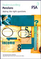
This included developing a colour palette to differentiate each of the financial areas covered by the FSA, such as mortgages, pensions, the Euro, annuities, ISAs, high yield bonds and financial advisors.
‘We have used a magnifying glass concept to draw attention to the key points and a ‘hand-written’ script to add an informal look,’ explains Hutton. ‘Colour-coding and clearly defined headings on the covers identify the various subject categories. The essence of the design is about the effective communication of an often complex and confusing area.’
Client: Financial Services Authority
Design: To The Point – Simon Hutton, managing director and project director; Mike Stafford, senior designer; Jeremy Austin, senior designer; Alice Sheridan, senior designer; Mike Rigby, consultant
Photography: Simon Battensby
Read this next

-
Post a comment


