Mackintosh look by ThirdEyeDesign
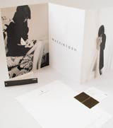
Mackintosh, the century-old menswear brand, launches a revamped identity by ThirdEyeDesign later this month.
The consultancy, which received a five-figure fee for the work, has also redesigned exhibition stands, packaging elements including swing tickets and labelling, stationery, carrier bags, brochures and coat hangers.
The consultancy was briefed to update the brand image, but retain the classic elements of the Mackintosh look, according to ThirdEyeDesign managing director Marc Noe.
The Mackintosh typeface has been redesigned and its ‘little man’ brand icon has been updated, says Noe. A fresh core colour palette has also been developed to work alongside a new secondary colour palette, which will change with the different fashion releases, he adds.
‘The Mackintosh brand has a history so we needed to retain that classic look while giving it a contemporary twist. It wanted something that would last another 20 years. The use of a secondary colour palette gives the brand an injection of colour and keeps it looking fresh,’ comments Noe.
‘The use of the little man icon as an independent feature will give a flexibility to the identity. It can sit on carrier bags or coat hangers, for example.
‘We want it to become an identity in its own right, like the Nike swoosh,’ he adds.
The consultancy was appointed in April without a pitch.
Mackintosh is expected to set up a standalone store in Japan in 2003. The consultancy has yet to be appointed to that project.
Read this next
-
Post a comment


