Creative Leap aids Almus range
Creative Leap has named and branded Almus, a range of generic medicines designed to help pharmacists to dispense drugs more quickly and meet Government packaging standards.
The work is the culmination of a six-month project, worth in the region of £50 000 in fees to the group.
Manufactured by Unichem, the range launches nationwide in high street pharmacies next month and features 38 of the most widely-used serious medicines available.
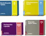
The packaging has been colour-coded to distinguish it from typical white box pharmaceutical packaging, says Creative Leap director Trevor Bradford. One vivid colour represents the type of drug and a secondary colour denotes the strength of the dose, according to Bradford.
‘It can be difficult for pharmacists to differentiate between products. We’ve used colour as signposts on both the front, back and sides of the boxes, which helps with storage,’ he adds.
The introduction of brighter colourways on the packs is also designed to aid patients who are on multi-drug regimes.
The Almus brand identity is designed to be contemporary and features clean typography. According to Bradford, the name is Latin and means ‘nourishing, kindly and life-giving’.
Creative Leap was approached by Unichem without pitching, on the strength of previous work.
The project was led by creative director Mark Chittenden, and kicked off with research undertaken by Creative Leap designers with pharmacists.
-
Post a comment


