Land Securities rebrands as Landsec
The commercial property brand has been given a new visual identity by Pollitt & Partners, centred around a stripped back cornerstone symbol.

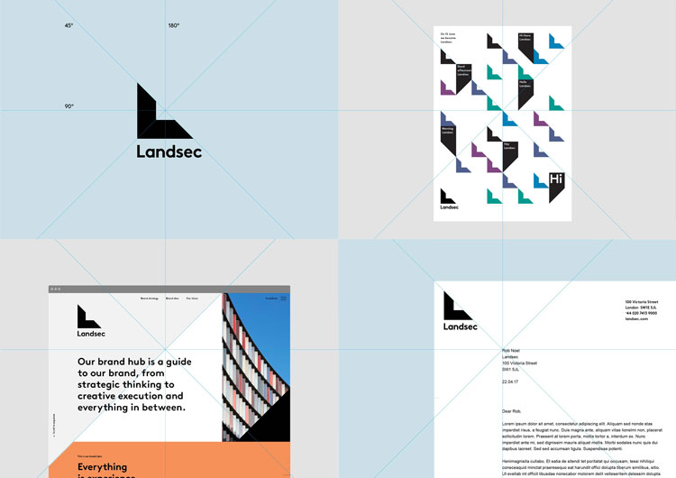
Pollitt & Partners has rebranded Land Securities, renaming the commercial property company as Landsec and creating a simplified visual identity.
Established during the 1930s, the FTSE 100 business has a £14 billion portfolio that includes Bluewater shopping centre in Kent.
The new identity aims to highlight the brand’s focus on “experience” design, says Pollitt & Partners, as well as nodding to its traditional association with “placemaking” and largescale commercial building projects.
Landsec is intended to be a “contemporary update” rather than a “complete departure” from the company’s original name, says the consultancy.
“Everything is experience”
The new identity is based on the brand idea of “everything is experience”, and features an updated version of Landsec’s existing cornerstone logo and a bespoke typeface.
The geometric cornerstone symbol looks to represent “the place where experience is and experiences happen”, says Pollitt & Partners. Its shape nods to the “L” in Landsec’s name, and it is also used as a flexible device that influences the other brand elements such as grids, patterns and typography.
A bold, sans-serif typeface called Brown has been chosen with the aim of complementing the geometric style of the logo. The consultancy worked with Swiss type foundry Lineto who created Brown to develop a bespoke version of the typeface in two weights: Landsec Brown Regular and Bold.
A main colour palette of black and white has been used, while other, brighter colours will be incorporated into the branding in the future.
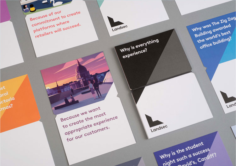
Illustrations
A new, more colourful style of illustration has been introduced for communications and other brand materials. The list of illustrators used so far includes Bruno Mangyoku, Peter Greenwood, Stephen Cheetham and Mark Boardman. Landsec says it plans to work with additional illustrators in the future as well.
“Illustration is one of the areas that allows great flexibility for Landsec,” says Pollitt & Partners design director Barry Tranter. “To allow that flexibility we have controlled it with a set of principles that illustrators need to take influence from, rather than dictating a specific style.”
For example, one of the principles is to “always show people and experiences”.
Pollitt & Partners has also created a set of brand guidelines, redesigned all internal communications and launched the brand with an internal campaign.
The identity has now rolled out across digital and physical touchpoints, and Pollitt & Partners will continue to work with Landsec to roll out the brand more widely.


Read this next

-
Post a comment


