Design Week’s 10 biggest stories of the year
The news that got you talking – we look at the ten most-read stories published by Design Week in 2015.
1. What the Tories are promising the design industry

Our most-read story this year was, rather fittingly, about one of the biggest UK news stories of 2015 – the Conservatives’ surprise majority win in the May General Election.
We took a look at what the party promised designers in its manifesto, spoke to Culture Minister Ed Vaizey and also took at look at what the Labour Party might have done in power if it had got in instead.
2. 6 tips for a great studio website – and examples of some of the best

How do you design a great studio website? This was obviously a question that a lot of you were asking yourselves this year.
In this piece, The Future Factory’s Tom Webster looked at some key pointers for designing a great website and also looked at some examples of the best.
3. Google has a new logo – we look at how it was designed

At the beginning of September, search engine giant Google unveiled its new logo. This came after the company launched its Alphabet corporate branding.
We took a look at how the new logo was designed – a process that saw designers from across the company come together for a week-long “sprint”.
4. Spotify undergoes colourful brand refresh

Music streaming service Spotify was rebranded by New York-based consultancy Collins in March.
The new identity saw Spotify broaden out its colour palette from just green and black to 31 new colours.
5. Can you still make a living in design? Or would you be better off serving coffee?

This was the question posed by Garech Stone, of Amsterdam-based consultancy The Stone Twins.
Garech saw an industry plagued by bad education, free pitches and facile work – and where graduates are forced to take menial jobs to make their ends meet. Judging by your comments on the story, many of you agreed.
6. Why Waterstones, Odeon and 10 Downing Street are dropping letters
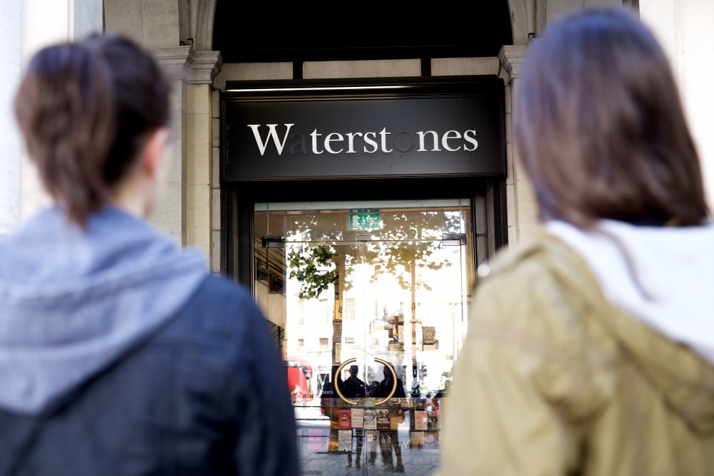
Why did all these organisations drop letters from their branding this year? Plenty of you read our story to find out.
(Spoiler: It was for an NHS campaign to encourage people to give blood.)
7. Tokyo Olympics scraps logo in plagiarism row

Just weeks after unveiling its new logo, designed by Kenjiro Sano, the Tokyo 2020 Olympics organisers decided to pull it, following accusations of plagiarism.
We’ve followed the story all year, from Sano’s protestations of innocence to the launch of a public competition to find a replacement logo, which has left the organisers now sifting through 15,000 submissions.
8. Loughborough University halts new identity rollout following protests
Alongside the Tokyo Olympics there was another ditched logo story that got you all talking this year.
This time it was Loughborough University, which “paused” the rollout of its new identity after an online petition opposing it garnered 12,000 signatures.
9. Coca-Cola launches new designs and “one brand” strategy

In March this year, Coca-Cola underwent a global rebrand, introducing a uniform look across its entire range.
Turner Duckworth created the new Coca-Cola visual concept and Epoch Design worked on UK packaging, while Bulletproof worked on other touchpoints, including digital.
10. Channel 4 deconstructs iconic logo in major rebrand

Channel 4 launched a wide-reaching rebrand in September, which saw the channel’s iconic “4” logo deconstructed for on-screen graphics.
The rebrand was led by in-house consultancy 4Creative, working with a team including Neville Brody and Under the Skin director Jonathan Glazer.
Read this next

-
Post a comment


