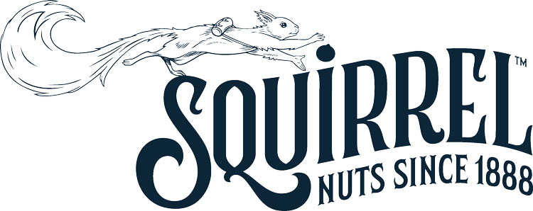
Zip the satchel-carrying squirrel roams through this nut brand’s new identity
Straight Forward Design has rebranded American nut company Squirrel, introducing a furry character called Zip.
Straight Forward Design has rebranded American nut brand Squirrel, introducing an adventurous and furry mascot named Zip.
The design consultancy, which has offices in London and Chicago, has also crafted an Art Deco-inspired wordmark and a range of redesigned packaging.

Squirrel was founded in Boston, Massachusetts in 1888. Since then, the company has expanded into a range of products – from nut caramels to almond snacks.
“Our brief was to reimagine what Squirrel could be,” says Straight Forward Design founder and creative director Mike Foster. This meant differentiating Squirrel in a crowded sector, he explains, and also placing an emphasis on the most important ingredient: the nut.

In recent years, many brands have increased sugar content to offset the cost of nuts in products, Foster explains. The studio was keen to “flips this on its head” and make the nut the centre of the story again.
Another ambition was to make the brand a contender in the gift category – “nuts are not an obvious gift product,” Foster says – so that they could sit alongside the likes of flowers, chocolate, and cheese.

To design the brand’s new mascot, Zip the squirrel, the design studio explored the brand’s history. The name, for example, came from an old piece of confectionery called zippers, Foster explains.
Though a squirrel icon existed for the brand already, the team wanted to create something more flexible and convey a sense of curiosity. “The original squirrel was drawn a long time ago and has been scanned, beaten, vectorised with all the care and love of the drawing lost,” Foster says.

While the new interpretation builds on this illustration style, Zip now roams free. “We didn’t want it to be static as this is very un-squirrel like,” the designer explains. In an attempt to bring Zip to life more fully, the designers gave them a satchel for foraging and a ‘Z’ flick in their tail. “Zip was born with a new vigour roaming freely around the logo,” he adds.
This is particularly important for the packaging. “Zip roaming around the pack invokes the wonder of possibility,” Foster adds. This flexibility – which Foster calls “lovely and whimsical” – allows the brand to tell bespoke stories for each flavour. On the package for Brazilian Cashews, for example, Zip is snacking on that specific nut variety.

The Art Deco elements of the brand, such as the new wordmark, were also inspired by Squirrel’s heritage, according to Foster. “These qualities come from the history of the brand and play well with creating something giftable,” he adds.
What do you think of Straight Forward Design’s rebrand for Squirrel? Let us know in the comments below.


So detailed and beautiful! The gold, the choice of colours and font give this a luxury and fun feel. I would happily give (and receive) these as a gift.
Beautiful! Love the way the word squirrel and little illustrated squirrel sit together to make the logo more fun – adds a great touch of detail and character to the brand look and feel.