
Lucienne Roberts on politics, power and design: “Just seeing a swastika provokes fear”
Publisher GraphicDesign& has published Hope to Nope, a new book examining the complicated relationship between graphics and politics. We speak to the co-editor about protest, power and design’s ability to incite both unity and hatred.
Political unrest and protest is on the up. The last few years have seen world events that have stirred the public into action, from protesting US president Donald Trump, to expressing conflicting viewpoints on immigration and Brexit in the UK, and campaigning against gender inequality and sexual harassment.
A recent show at the Design Museum epitomises the trend of political engagement over the last 10 years. Hope to Nope explores political design from across the world, looking at both sides of the story – those in power, and those who protest.
Publisher GraphicDesign& produces books that delve into the relationship between graphic design and various topics, having previously tackled healthcare, religion and mathematics. Now, it has focused on politics, producing a book to accompany the current exhibition.
We speak to Lucienne Roberts, co-curator at the Design Museum show and co-editor of new book Hope to Nope, about the power of effective protest design, the blurred boundaries between “good” and “bad” and why the swastika is one of the most fear-inducing symbols ever made.

Design Week: Why did GraphicDesign& compile this book on politics and design?
Lucienne Roberts: Like the Can Graphic Design Save Your Life? exhibition, we wanted to do a book to accompany our curatorial endeavours. Books last while exhibitions eventually go, but also books have a tactile quality that allow you to do lots of different things. Every time we do a book, it’s quite a challenge making and producing a book to suit the subject matter.
DW: How does the design of the book suit the subject?
LR: My studio, LucienneRoberts+, designed the book – we wanted something shouty but also earthy. The cover is grey board – we looked at printing on gold because of Donald Trump but we felt the grey was nice to hold and very appropriate. We substituted magenta with fluorescent pink, which makes the images ping a lot more and makes the book feel like it’s been printed, giving it a “zine” feel.
There are four images of political figures on the cover, and it says “hope” and “nope” on each one, inspired by Shepard Fairey’s original Barack Obama “Hope” poster and the spoof Donald Trump “Nope” poster that was made recently.
Fairey created a meme generator that allowed people to recreate images in this style, and so we put the images through that, then retouched them afterwards. We wanted to talk about how his poster became a meme – that’s what inspired the title of the show and book. The cover suggests that one person’s “hope” is someone else’s “nope”.
There is no spine to the book, it’s all stapled. We ran the colour off the edge of every page, which makes a pattern of arrows on the fake “spine”. These arrows point up and down, again suggesting “hope” in one direction and “nope” in another. The design feels quite unusual.
DW: Do you feel the age of protest has brought political graphics into the spotlight?
LR: Design and politics have always gone together, really. I think it’s just that people are angrier now, they’re more aware. Whenever you talk about graphics and politics, people think about placards, protest posters and stickers – but a political party manifesto is designed, as are important political books. It’s always been part of the process.
That’s where it gets interesting. There are things you can credit to a designer, and things produced by amateurs, which are no less designed. In this sphere, you see fantastic pieces produced by non-designers that are very authentic.

DW: The book features interviews with Milton Glaser and Shepard Fairey – what did you learn from them?
LR: Milton Glaser has been around a long time. He still cares passionately but when you’ve seen things get better then worse again, it’s hard not to become disillusioned. He talked to us about Buddhism and made pertinent points about design that makes a difference, as opposed to design that makes the designer feel better. Expressing anger and shouting doesn’t necessarily persuade somebody to change their mind. But equally, I do understand the need to shout and get angry.
Shepard Fairey is very direct and his interview reads more like a how-to piece, it’s very advisory. It must be odd to have produced something that has become such an icon. It shows how you lose control of things very quickly. He spoke about the need to make something communicate quickly and be understandable. As designers, it’s very easy for us to assume visual sophistication in our audience that might not be there.

DW: What do you think are the most important political design works ever created?
LR: Flags and currency are key. Both are so tied up in nationalism. The Union Jack flag is so divisive, and if you’re seen to be left-wing, particularly people of my generation, there is no way you would hang up a flag in or outside your house. That’s so conflicting and shows the power of these abstract marks.
Money is also political. The Brixton Pound, a bespoke, complementary currency for local businesses in Brixton in South London, is a fascinating story. While it is encouraging local businesses, there’s also the point that if everyone just had the same currency, wouldn’t that eradicate some awful differences between us?
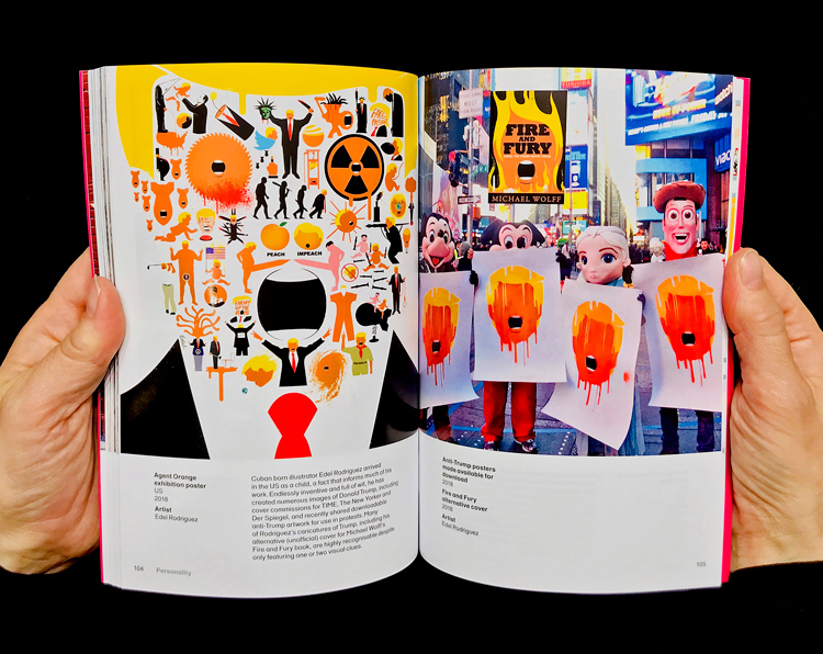
Then there’s the swastika – one of the most famous and successful logos, or marks, of all time. Just seeing one provokes a certain amount of fear. Recently it’s been re-appropriated because of Donald Trump, which makes it feel a little more benign but it really isn’t – you only have to look at photos of massive Nazi rallies in the 1930s and see everyone wearing one on an armband and on banners. It’s hard to find another example of a mark that has been so memorable and effective in a negative way.
The opposite end of the spectrum is the work of the Suffragettes. They produced leaflet upon leaflet, extraordinary banners, fantastic placards. The work is beautiful but also impactful. They were one of the first organised groups to really harness design, and it made a difference – women wouldn’t be able to vote if it hadn’t been for them.

DW: What does this book offer that the exhibition does not?
LR: We were very mindful that the exhibition would close in a few months. We wanted to make it accessible to people who can’t get to it, and also provide a printed curation of our research. A book is really the only way to do that, it has a much longer life. This information isn’t available online – the individual pieces of work might be, but you won’t find it all put together.
Reading a book is also such a different way of digesting material. A show like Hope to Nope bombards you with stuff – sometimes you’ll read a label, sometimes you won’t. Sitting down and reading a book is an utterly different experience, it’s more contemplative.
Some of the more touching stories will also come through more effectively in the book. Like The Complete Lexicon of Crisis-Related Suicides, a book that looks at the number of suicides post-financial crash – it’s very affecting and reading offers a bit of quiet time to think about it.
There’s also some projects that don’t feature in the show – we didn’t want the book to be repetitive. I’m very interested in designers who are political and manifest this in writing and speaking about it, so we include more detail on people like Mike Monteiro, who wrote the How to Fight Fascism talk, and more background to Michael Bierut’s Hillary Clinton campaign. There’s more works by key designers like Milton Glaser and Shepard Fairey, and more detail on some projects, with a lengthier introduction.

DW: Hope to Nope looks at how design is used to both subvert and assert power, by protesters and by authorities. Has political design been used more as a force for good or evil? Are these boundaries blurred?
LR: It’s not true to say that protest, or bottom-up, is always good, and authority, or top-down, is always bad. I guess when political design is created by designers, they are often left-wing so are trying to support the underdog in some way, or campaign for people’s rights. But it’s very difficult to be too clear-cut about that. After all, no money is clean money. You could work for a charity rather than a large corporate as a designer, but charities are funded by all sorts of sponsors. The notion of “good” is so loaded.
But generally, designers tend to be idealists – they are interested in utopian and radical ideas, in changing things and are motivated to make a difference. Pool all that together and you get a bunch of people who want to make the world a better place, broadly speaking. I’m probably slightly romantic about all of this.

DW: What do you hope readers will take from this book?
LR: What I want is for designers to feel more empowered. We are trained to communicate messages effectively – thinking about what those messages are and what effect they have is hugely important. Even if you make a difference to one person, that’s still worth doing.
I also hope the book is something that makes people feel things are possible rather than impossible. I was very struck by some of the stories, which are moving but also hugely impressive. Both professionals and amateurs show bravery in making and disseminating this work, and this can be punishable in some countries – that’s why we tried to make the show and the book as international as possible. We hope this spurs people on, and makes designers and the public alike politically engaged, whether that’s through voting or making a poster.
Hope to Nope: Graphics and Politics 2008-18 is available now globally through GraphicDesign&’s website. For more info, head here.

-
Post a comment


