
Getting to know Marylou Faure and the “strong and feminine” women she draws
The Parisian illustrator is well-known for her playfully proportioned women and colourful characters — but where does this style come from?
“I always try to present my female characters in a similar way — as strong and feminine, in the hope that some of their qualities will reflect on me, as well as my audience,” says Marylou Faure. “My characters never care about what other people think about them and neither should we.”
The above is a quote from the Parisian illustrator’s new monograph — a 216-page compendium of illustrative work published by Counter-Print. It features work from across Faure’s portfolio, from personal projects to client work and commissions.
It’s an impressive collection, especially given that Faure says her career only really began five years ago.

“I wanted a style that was colourful, quirky and fun”
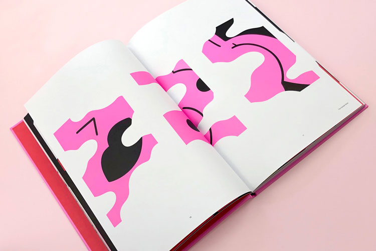
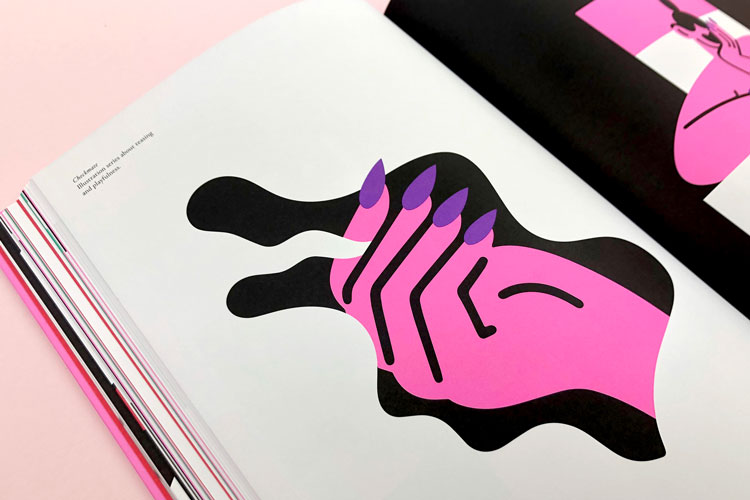
With bold block colours and flat shapes, spliced with thick black and white lines, Faure’s work has become instantly recognisable to many. It’s a style that she is proud of, she tells Design Week, but one that continues to evolve as she does.
“I wanted to have a style that was colourful, quirky and fun,” she says. “[It’s] a style I feel strongly about and can put all my character into.”

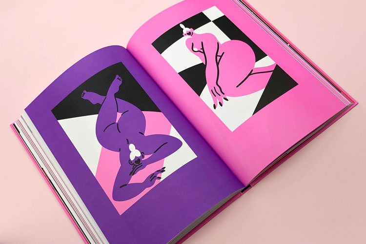
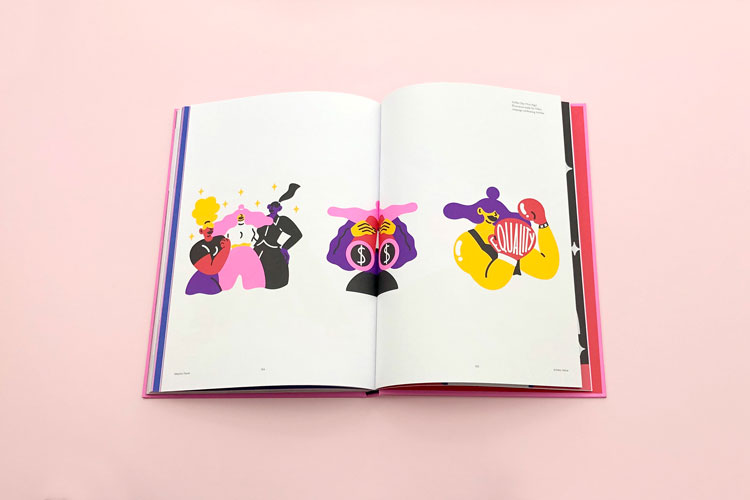
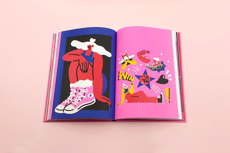
Women are central to Faure’s aesthetic universe. Always playfully proportioned, these women can switch between conveying sensuality, strength, innocence and a host of other emotions; and characteristically drawn without eyes, their bodies and surroundings are what tells the story.
Faure lists a diverse set of inspirations: Malika Favre, Helmut Newton, Hattie Stewart, Piet Parra, Henri Matisse. With the exception of Newton and his black and white photography, the rest give a good sense of where Faure developed her own colourful craft.
“I always want to be happy with the final outcome”
That craft was then honed by studying graphic design, including a masters degree in art direction and digital design, in her native France. After completing these courses, Faure moved to London, a place she had spent a considerable amount of time in while growing up. In the capital, she undertook a series of internships before finding work with creative studio Nice and Serious.
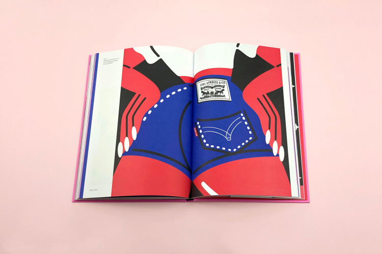
Having such a distinctive style is both a blessing and a challenge, Faure says. On the one hand, it allows her work to be instantly recognisable, whether she’s working for Levi’s, Deliveroo or MTV (she has worked for all three). But adapting this style to fit different commercial contexts and clients is important.
“Even though my style is very clear and defined, to me it doesn’t take much to make it look completely different,” she says. “Having my work be seen as commercial is obviously a good thing, but it does mean sometimes having to fight over some small details to make sure I don’t lose the essence of my work.”
Having these conversations is something Faure says she feels passionately about: “I always want to be happy with the final outcome.”
“The need of one visual that tells a story”
Readers of the book will no doubt be used to seeing Faure’s work in a variety of different contexts and she says there is no one type of commission that she finds herself doing more often than another.
“I work a lot on editorial pieces for both print and online, as well as posters and illustrations for social media,” she says. “I think what they all have in common is the need of one visual that tells a story — condensing an article, an event, or a campaign in one illustration and easily understanding what it’s about.”

As for how she does this, Faure explains all of her work begins life as lots of rough sketches in a notebook. Once she’s tried and tested different ideas and compositions, Faure migrates to digital drawing on an iPad. Notably, at this stage, there’s no sign of her trademark use of bright and bold colour.
“That’s the first thing I’ll share with the client, and when that’s approved, I move on to colour,” Faure says. “Usually, if the sketch feels right, then there won’t be many changes needed with the colours — it’s all about getting the composition and the contrast right in the sketch phase.”
Creatives should “use their skills for good”
Faure is part of the ever-growing number of creatives that refuse to divorce their work from the socio-political and ethical world it exists in. The “strong and feminine” women that she draws are part of a central theme of her practice which advocates for equal rights for all and a strong representation for women.
Her list of previous clients, she explains, reflects her intention to tackle issues she cares about through her work. It includes the likes of the United Nations, D&AD and Refinery29 — organisations she believes “focus on social and ethical issues”.
As she explains in the new book, Faure believes creatives should “use their skills for good”. But she adds that staying confident in your beliefs and craft, and accepting that “a lot of things just fall through” are some of the biggest challenges facing illustrators in the industry today. How does she overcome these hurdles?
“[I’m constantly] doing checks on where I’m going in my career and making sure I’m in the right direction,” she says. “This way, I stay happy with what I do and the work I produce.”
Marylou Faure is published by Counter-Print. It is available now for £30.00 from the website.

-
Post a comment


