Museums Association’s visual update balances heritage and activism
The campaigning organisation, which comprises over 10,000 members, needed an identity that would align it in the modern cultural landscape.
Studio Output has created a new visual identity for Museums Association (MA) which seeks to evolve the campaigning members organisation.

The London-based studio’s work also includes a new digital platform for the cultural organisation as well as an update to its editorial branch, Museums Journal.
“Not part of the modern landscape”
Studio Output creative director Johanna Drewe tells Design Week that there were two main considerations for the branding work. The first is the organisation’s heritage.
It was established in 1889 and has a “lot of authority and heritage within the industry”, she says. This means that the organisation had a big group of existing members who are actively engaged with the brand, and their views needed to be respected.
On the other hand, the organisation “didn’t feel part of a modern landscape”. While the organisation writes on relevant issues within the cultural sector — such as “decolonising and dismantling of racism in museums” — the website and brand didn’t engage or reflect this more “progressive” content.
“Super rich territory”
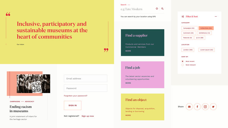
It was important for the visual identity to have layers, Drewe says. Part of the brief was to show that “museums are not about buildings and objects, they are spaces to have your perceptions challenged and your ideas broadened”.
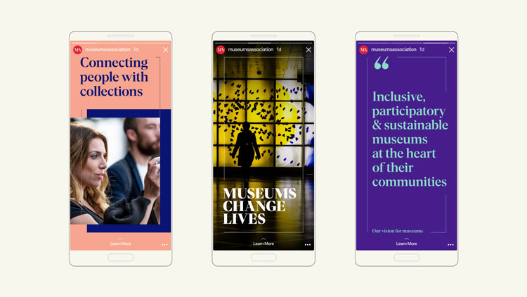
This offered a “super rich territory” for the branding, and influenced the photography, eclectic colour palette and typography.
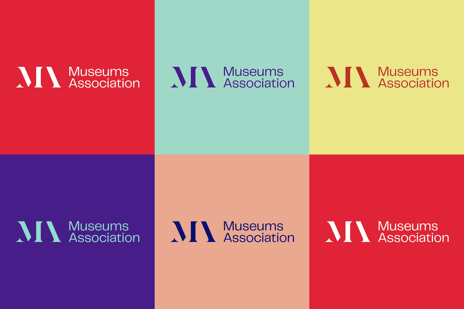
“Nobody ever sees the full picture”
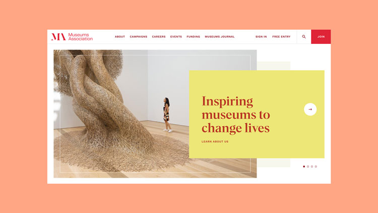
Drewe points to a keyline frame which moves in and out of view, bringing visual components together but also “allowed them to break free”. The result is a multi-faceted identity which suggests that “nobody ever sees the full picture”.
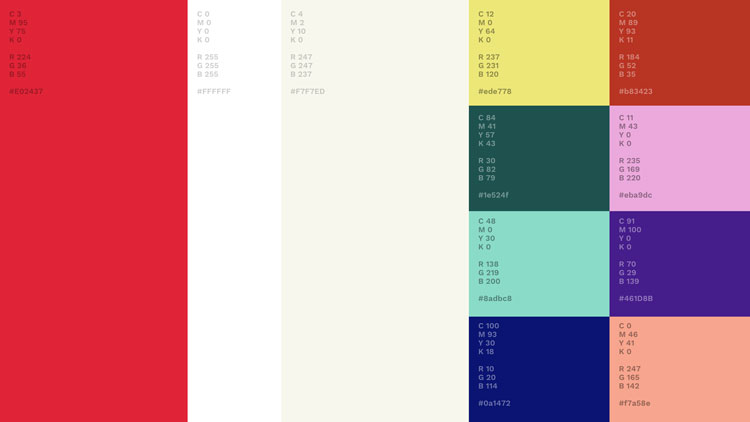
The colour palette was chosen to reflect the heritage of the MA while also embracing a forward-step. Likewise, the type stack and layouts are an attempt to show its relevance to current conversations. They “blend the organisation’s heritage with its forward-facing activist evolution”.
The new logomark has a stencil effect and balances tradition with a more modern minimalism.
Studio Output also created a digital platform for the organisation as part of its “evolution”. While this was not to target a new audience directly, it is part of the organisation’s expanded remit. Over the past few years, it has also developed into a “campaigning body and values-based organisation”.
“Concise” and user-friendly nagivation is part of this update, which the studio hopes make the virtual side of MA more “intuitive”. It’s also a tool for finding jobs, objects and suppliers.
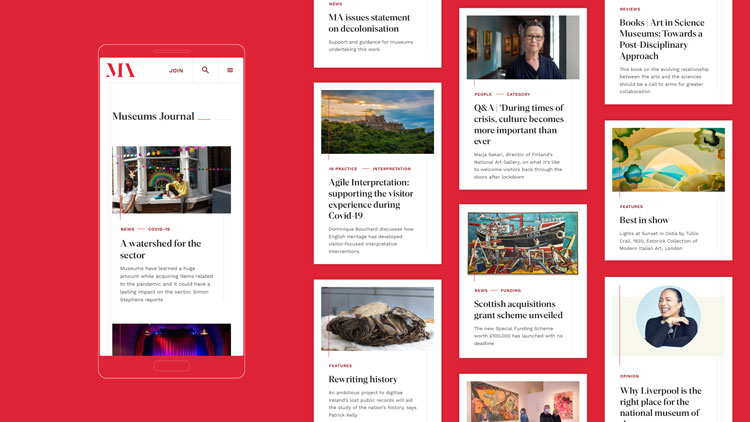
The editorial side of MA, Museums Journal, has also been updated to offer a more “credible reading experience”. Tags have been introduced to highlight the wide range of content on offer.
This interface picks up the red from the new logomark.
ParaSupreme has been chosen as the headline typeface, for its ability to “flex across different applications from campaigns and events to editorial content”. The typeface has “chiselled edges” and “structured” characters which provide an “impactful” tone across these uses, Drewe says.
In an attempt to “offset” this, Sans was used for the logotype. Drewe says that the combination of these two typefaces “creates a dialogue between the heritage of the Museums Association and its forward-facing, activist personality and evolution”.


Bit too close to the V&A logo for my liking. Very unoriginal.
Did anybody else think – V&A – when they saw this..?
Couldn’t agree more! One look and it was the V&A concept straightaway. Very weak.