
Creative Spark brand hospitality app Peazi with “northern charm”
The app has been given a new visual identity in an attempt let customers order food and drink while maintaining social distancing.
Manchester-based design studio Creative Spark has created the “vibrant” branding for recently-launched hospitality app Peazi.
Peazi has been created in an attempt to maintain social distancing measures as restaurants begin to serve customers once more post-lockdown (though measures are being changed often).
Customers can scan a QR code at each table to view menus. All orders can then be placed via the app which means contact time is limited. It aims to offer protection to both staff and patrons.
Peazi has been in development for years, but is clearly newly relevant in light of the pandemic. The app co-founder Niels Nielsen says: “We had no idea how relevant the app would be to 2020 and the reopening of bars and restaurants.”
Behind the branding
Creative Spark creative director Neil Marra tells Design Week that the identity needed to “inspire” customers to pick up and use the app in a bar or restaurant.
As well as customers, branding also had to appeal to the B2B sector by showing how Peazi can “ensure safety for their staff with socially distant ordering, reliable financial security and be easy-to-use for customers”, the designer adds.
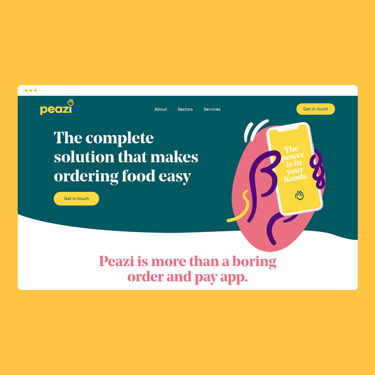
This was achieved by focusing on how the app puts the power in customers’ hands when they choose a venue and order food and drink. Visually, this was communicated through a range of hand icons, a “vibrant colour palette” as well as “fun” imagery.

The hand icon that has been adopted as the logo is synonymous with “capturing a waiter’s attention or an eye-catching wave when asking for the bill,” Marra says.
Various hand gestures have been created in an illustrative style and are used throughout the identity, from a thumbs up to a wave. It’s also used to compliment photography of food.
Noe Display has been used as the primary typeface, while TT Commons has been used for the wordmark.

Given the studio’s Manchester roots, a “northern charm” has been incorporated through the tone of voice, Marra explains. The strapline is: “Order, Eat, Pay, Bounce” while other phrases are in use throughout the app such as “Wet your whistle, way faster” or “See what’s on tap”.
This “unique” aspect has been supported by the photography, Marra says. He hopes that the images of “the fashion and the people are recognisable to a northern punter”.

-
Post a comment


