A “youthful” new brand identity for Belgian radio station Q music
DixonBaxi has created a new visual identity and branding for the radio station, with the aim of making it more “contemporary” and targeting its younger audience.

Consultancy DixonBaxi has created a new brand identity for Belgian radio station Q music with the aim of targeting a “youthful audience”.
The radio station plays pop music and broadcasts in Flanders, Belgium and Holland.
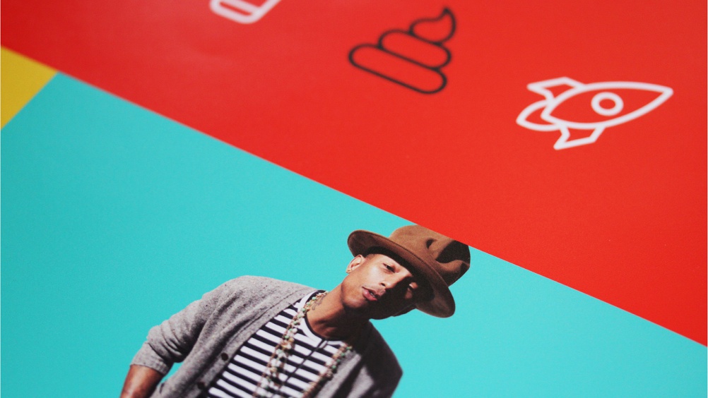
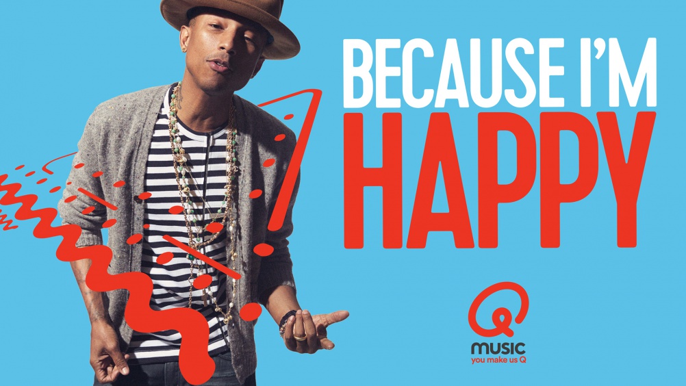
DixonBaxi redesigned the “Q” marque by turning it into a “gestural stroke”, says the consultancy, while maintain the original red colour and flattening it with the aim of creating a “singular, iconic mark” that will “work across all platforms”.
The rebrand also includes emoji-style pictograms, “vibrant pops” of colour and big typography, and photography of musical artists which places them at “focal points” of the branding.


The consultancy has also aimed to focus the station on its audience with new strapline “You Make Us Q”, in order to invite them to “participate and play”, it says.
Aporva Baxi, co-founder at DixonBaxi, says: “With the new look, we’ve repositioned Q music and helped to simplify and modernise the brand to reflect the immediacy of pop. This is underpinned by the new strapline, giving the radio station a purpose – which is about what Q and the audience can do together.”
The new branding has started rolling out, and has been applied to print and online elements and marketing collateral.


Does look more like a broken Airbnb or @ symbol…
The “Q” isn’t that recognisable, because it interrupts the circle projection, or maybe this large tail loop, in my opinion. But, the typography and the color is very well executed.