Pressure group
Letterpress may be an anachronism alongside today’s digital printing techniques, but Alan Kitching and his letterpress students at the RCA are keeping the process alive in bold, dramatic style, says Jim Davies
‘The golden rule is that there are no golden rules,’ says Alan Kitching, with a smirk and apologies to George Bernard Shaw. He’s talking enthusiastically about the ever-popular letterpress course he’s been running at the Royal College of Art for the past 14 years.
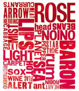
Kitching backs up his claim by pulling out example after shining example from the piles of student work that are waiting to be assembled for The Rules of Typography, a forthcoming exhibition at the college’s Hockney Gallery. One piece has been made from an impression of hundreds of safety matches to make up a giant ‘I’, another hewn from roughly cut card that looks like a child’s potato print, then a classically set piece of hot metal. If Kitching doesn’t know where to lay hands on the next piece, technician Ian Gabb, his right-hand man, always does. Everything has its place, though it’s not necessarily the obvious one.
Walking into the letterpress department in the RCA’s Steven’s Building is like stepping into a time warp. It’s made up of two cramped studios and an adjoining corridor lined with drawer after drawer filled to the brim with ancient type – everything from Cancelleresca Bastarda to Figgins Shaded, with Baskervilles and Futuras in between.
The scant remaining floor space is taken up by several no-nonsense proofing and printing machines that resemble small tanks. There are shelves of plastic cups full of printers’ ink in varying stages of hardness; posters drying out on a makeshift line; piles of papers of different shapes, sizes and textures; racks of printing blocks. I feel like I’m going to be denounced as a heretic when I produce a dinky silver MiniDisc to record our conversation – it looks like a tinny, insubstantial toy next to these imposing mechanical beasts.
But despite their uncompromising physicality, these well-loved, well-used machines were once in grave danger of extinction. Back in the 1980s, when incumbent rector Jocelyn Stevens was on a mission to streamline the college, this redundant technology was seen – literally – as a waste of space. It took all the persuasive powers of successive professors of graphic design Gert Dumbar and Derek Birdsall to save them – and Birdsall had the good sense to install typographer Kitching, his former partner at Omnific Studios, to stand guard over them.
Kitching is one of the country’s foremost exponents of letterpress printing, treading a fine line between graphic design and fine art. His bold, blocky, distinctive work is regularly exhibited in galleries, but he also tackles packaging, corporate identity and even stamps. However, he uses letterpress not so much as a means of automated reproduction, but as a medium for experimentation and exploration. And it’s this spirit of graphic discovery that he’s keen to instil in his students. ‘I don’t tell people what to do,’ he explains. ‘I just give them a point of departure.’
This usually takes the form of a loose, one-off theme. A word or phrase such as ‘film’, say, or ‘manifesto’, or ‘portrait’ or ‘dictionary definitions’. With well over 100 of the three-week courses under his belt, it’s impressive that Kitching has never repeated himself. This intellectual range, combined with the rough-and-ready tactility of the printmaking, goes some way to account for their popularity – not only among graphic designers, but also illustrators, textile designers, and even the odd furniture maker and architect.
The cosy working conditions mean that places are strictly limited to six students per session, but there are eight workshops held over the course of a year. So, doing the maths, The Rules of Typography show will feature the work of 48 current RCA students. The topics tackled this year include an interpretation of The Loom of Language, a complex book on linguistics and etymology by Fredrick Bodmer first published in 1944. Kitching photocopied pages from this dense volume at random, and then handed them out to students to illustrate typographically. The RCA library’s special collection of rare books provided another rich and varied starting point.
But undoubtedly, this year’s most interesting project is based on the humble compositor’s tray. This involved the work of four student groups, plus contributions from Kitching and Gabb, with all 26 pieces coming together to form a massive whole. Sized to be carried by a single, reasonably strapping man, these large wooden drawers are divided into sections designed to house the lugs of each letter. But because certain letters in the English language occur with more frequency than others, some housings are much bigger than others. E is the largest, closely followed by the other vowels. X and Z are on the diminutive side, and J and U, because they came into general usage relatively late, appear out of sequence – almost as an afterthought. Brought together, these variously sized interpretations of the alphabet form a giant typographic jigsaw that dominates an entire wall of the exhibition.
There’s a certain irony in the fact that an obsolete printing process can inspire such topical and vibrant results. But the organic nature of the letterpress and the interesting imperfections it throws up are a welcome antidote to digital blandness and predictability.
The Rules of Typography runs from 18-23 April at the Hockney Gallery, Royal College of Art, Steven’s Building, Jay Mews, London SW7
-
Post a comment


