Spanish design inquisition
Mike Dempsey assesses yesterday’s relaunch of The Independent, in its new suit of Catalonian clothing
Almost 20 years ago, I, along with my then partners Ken Carroll and Nick Thirkell, presented our design concept for The Independent, the UK’s first national broadsheet for more than 130 years. Launched in 1986, it rose out of the ashes of much bitter fighting in Fleet Street, brought about by the upheaval of technological change.
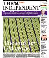
Our design centred on a classical typographical structure juxtaposed with a dynamic use of black and white photography, and it became a huge success with its readers. But over the ensuing years the paper has undergone an alarming number of redesigns, six to date, mostly triggered by financial or critical catastrophes. But Tuesday saw a more serious relaunch of the paper. For the first time since CDT’s 1986 original, the paper has again gone out of house for its design.
Enter Barcelona-based editorial designers Cases Associates. The Independent’s art director Kevin Baylis found the experience of working with Cases both fascinating and liberating. He says, ‘You need an external perspective to really bring something new. [Cases] explored options that had never occurred to any of us here at The Independent.’ Baylis is very pleased with the result and Cases is on hand to iron out any hitches.
And what of the new design? Well, it has a flexible seven-column grid, using Benton Modern No 2 as the bodytext face, along with a combination of Sun Display – a derivative of Century Bold – and Whitney, a sans-serif face originally created for the Whitney Museum. These are, says Baylis, the only faces to be used. The main reason for the redesign stems from last year’s change from broadsheet to compact. ‘Originally we just shrunk the broadsheet down and although our readers liked it (the past year has seen significant increases) a radical design assessment had to be made,’ says Baylis. The new design is a vast improvement on the more recent incarnations. But is it innovative? On that I have to say no. It is clean, controlled and has pace, but is rather formulaic, characteristic of Cases’ editorial approach. You have to still look at the integrity with which The Guardian has nurtured David Hillman’s original design vision of that paper. It’s evolved intelligently, without ever discarding its soul.
And it will be interesting to see if the management of The Independent can resist the knee-jerk reaction to grab the mouse the moment there is any erosion of their readership.
Mike Dempsey is a founding partner of CDT Design
Read this next

-
Post a comment


