Elmwood redesigns Andrex packaging
Elmwood has redesigned the packaging for Andrex toilet tissue, aiming to ’reaffirm its position as an iconic brand’. It has worked on the project since its appointment in February 2010 following a four-way strategic pitch.
Simon Preece, Elmwood’s group client services director, says, ’It’s about re-engaging with consumers and demonstrating why it’s worth paying more.’
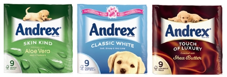
Elmwood was briefed to reconnect emotionally consumers with the brand and more strongly communicate Andrex’s benefits across the range. Preece says Elmwood ’calmed down’ the branding to create ’simple, iconic’ packaging, embellishing the logo with a ’swoosh’ motif to add impact.
Elmwood senior designer Steven Shaw says, ’We changed the visual and verbal presentation of the portfolio. We created a clear and consistent pack architecture and benefit-led naming to clearly communicate the distinctive product propositions.’
The new packs reinstate the ’soft, strong and very long’ strapline, with matte packaging to reflect quality and create on-shelf standout. A headshot of the Andrex puppy replaces a full image on the classic white packaging. Preece explains, ’It puts some emotion back into the brand – [the puppy] says, “Buy me, take me home”.’
The UK packs launch at the end of this week, followed by a European roll-out.
Read this next

-
Post a comment


