Carling reviews packaging design
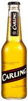
Carling lager is brewing up a new image for the new year to provide the brand with a more streamlined look. The new look, designed by Jon Davis of Holmes and Marchant, features a C-shaped font with an illuminating panel. Some 55,000 fonts will be rolled out to the trade from February 2001. The company will also be launching new-look cans, bottles and glasses in the new year, also by Holmes and Marchant.
Start the discussionStart the discussion
-
Post a comment


