New life for classic brands
The key to reviving a tired brand is be sure it’s salvageable and then be truthful about its values. Hannah Booth reports on the mission to wake up some neglected consumer products
Reviving consumer brands from previous eras, an issue rarely out of the spotlight these days courtesy of marques such as Blue Nun and Le Piat D’Or, is news again with the relaunch this month of Angel Delight (DW 7 June).
Plans are afoot to relaunch 1970s Portuguese wine brand Mateus Rose and Lewis Moberly has been appointed to the task.
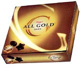
And even long-established chocolate box brand Terry’s All Gold has been given a design tweak this week by FLB to re-emphasise the 101-year-old brand’s “goldenness”.
Rejuvenating classic brands from 30 or 40 years ago to appeal to 21st century consumers demands in-depth product knowledge and intelligent repackaging to retain the brands’ values, but ensure they are relevant to contemporary shoppers.
The heritage of Terry’s All Gold is in its gold colour, FLB creative director Colin Mechan says. This has been reinforced on the box, which now appears lighter on-shelf, lending it greater stand-out, he adds.
Design Bridge took on Terry’s All Gold in around 1995 as “it was not doing well”, says creative director Graham Shearsby. “It was just another oblong chocolate box and there was little interest in the brand.”
The consultancy introduced a cube-shaped box to make it more “giftworthy”, created more layers inside and designed an icon around the letter G that would help extend the range into milk, mint and white variants. This rejuvenated the brand, he claims.
Originally launched in 1967, children’s dessert Angel Delight features redesigned packaging by Brandhouse WTS, which focuses on Angel Delight as a fun way of bringing together mothers and children.
“We used contemporary ‘pop art’-style artwork to bring the brand up-to-date,” says Brandhouse WTS design director Melonie Maynard.
The group has also updated the bottle and packaging for Fino sherry brand Tio Pepe, relaunched in March to combat the declining sherry sector in the UK.
“People in this country traditionally view sherry as a sweet, sickly drink in a dark brown bottle that languishes at the back of a cupboard and only comes out at funerals,” says Brandhouse WTS creative partner Mark Wickens.
In reality, Fino is an extremely dry fine wine that just happens to be a sherry, he says. Consumers’ wine palettes are maturing in the UK and dry sherry is increasingly regarded as a drink for all occasions.
The aim of the redesign was to focus on Tio Pepe’s brand rather than the sherry genre, “transcending the category” in the same way Absolut Vodka is a brand not just a vodka, says Wickens. “We talked up the dryness of Tio Pepe and emphasised the fact it is not just for special occasions, trying to educate consumers without being patronising.”
The resulting green glass bottle highlights the fact it’s a white wine-coloured drink and lends it dry white wine values.
German white wine Blue Nun is undergoing a strong revival, claims brand manager Toby Hancock. Its most radical redesign, in 1997, saw a blue bottle replace the brown bottle, designed in-house by FW Langguth in Germany, and the creation of a drier wine.
In December 2000, Claessens International created a series of labels to launch Blue Nun’s Merlot and Riesling brands this year, as part of the brand’s £1m global repositioning campaign.
Mateus Rose looks set to be similarly revamped. Several packaging concepts are in test abroad. If successful, these could be introduced in the UK next year.
“The Portuguese [Mateus Rose brand owner Sogrape] are aware that its packaging has not changed in 30 or 40 years,” says Alec Guthrie, marketing manager at its UK distributor, First Drinks.
He says a resurgence in all things “yesteryear” across most sectors has led to revivals of bygone brands. “Retro-marketing is in vogue, and the wine market is no different,” he says.
For a brand to make a successful comeback, it must return to the values that made it popular in the first instance, he adds.
However, any brand must move with the times, as most people will view it with a different perspective 30 years on.
Claessens International chairman Francis Claessens says consumers will always make wine purchasing decisions based primarily on the product’s looks. “For mistreated wine brands, bottle and packaging design is where [a brand revival] starts,” he says.
Two things are vital before an older brand or one in a declining sector can benefit from a relaunch, says Wickens. The brand must be salvageable. And its owner and consultancy must be truthful about its values before injecting new life into it.
“For example, I would struggle to relaunch a typewriter in the face of modern computer technology. But any tired brand or old classic must be seriously researched and not just thoughtlessly modernised,” he adds.
So what “tired” brand would designers like to get their hands on? “Spam,” says Wickens. “It would be a great challenge and a real latent opportunity.”
An opportunity indeed and one that has been taken up three times in the past eight years.
Reviving some brands is clearly more difficult than others. Spam has been relaunched in 1985, 1988, 1989, 1993, 1996 and 1998.
Read this next

-
Post a comment


