A graphic representation at this year’s Turner Prize Doctoring historical fact
We’ve finally made it to Tate Britain to check out this year’s Turner Prize shortlist. For some reason Nick Serota decided to invite Culture Minister Kim ‘conceptual bullshit’ Howells to the opening instead of us. Pah.
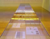
Anyway, graphic and interior designers will be interested by Liam Gillick’s entry (pictured courtesy of Corvi Mora, London) – which features studious technical drawings of Spanish supermercado frontages as well as east European exhibition catalogues.
The secret, it seems, for getting signage and book designs into the high-art limelight is using Neue Helvetica and a tawny brown Pantone. Oh, that and runningthewordsofthecopyline together, like so.
Easy, when you know how.
Read this next

Start the discussionStart the discussion
-
Post a comment


