Profile: Stephan Müller

Stephan Müller’s near obsession with collecting typefaces led the Berlin-based graphic designer from diversion – via Lineto and major contracts – to commercial accomplishment, says Hannah Booth
Stephan Müller collects typefaces. He doesn’t rip out pages from books or magazines. His methods are more guerrilla, like the time he got down on all fours and did rubbings of foreign car number plates until he had a collection big enough for an entire typeface. Or when, rummaging through a flea market, he chanced upon an Olivetti ‘Valentine’ typewriter and hit every key until he had a sheet containing each icon. Friends add to his collection: a colleague recently returned to Berlin (where Müller is based) brandishing a billboard from London’s Evening Standard newspaper because he thought Müller would like it.
Müller doesn’t so much design typefaces as stumble across them raw. ‘I’m not a typographer, I’m a graphic designer. The former want to create the perfect alphabet; that doesn’t interest me,’ he says in strong Swiss German. He digitises everything he finds, such as ancient typefaces from obsolete type foundries. ‘But I don’t “create” them,’ he insists. ‘They’re already out there, I just take them out of their usual context. If there is no existing typeface suitable for whatever job I’m working on — and there often isn’t — I find one myself.’ Perhaps this freewheeling, magpie approach is rebellion against Müller’s Swiss graphic design upbringing. ‘I was taught that typefaces must have no life, and not say anything. It’s typical Swiss thinking,’ he says.
Müller has two professional sides: graphic designer, and co-founder (with Cornel Windlin) of fast-emerging cult website, lineto.com. Lineto is home to hundreds of original typefaces, created by designers including Alex Rich, James Goggin and Müller himself. ‘Numberplate’ is one of his latest, an update of a typeface by Windlin based on British car number plates. The story goes that the German government issued a reworked typeface for its number plates, which it claimed was harder to forge. Weeks later, Müller had put this to the test and created Numberplates.
Müller and Windlin started Lineto in 1993 ‘as a hobby’. ‘We assumed that once every 1000 years someone would stumble upon us,’ says Müller, but it took on a life of its own. By 1998, it was selling typefaces, and it was relaunched in 2004. Goggin, recently appointed art director of The Wire magazine, is designing his second typeface – Prismaset, a reworking of 1930s font Prisma – with Rich, exclusively for Lineto. ‘Lineto has a cult aura around it,’ says Goggin. ‘It’s not mainstream, but surprisingly many advertising agencies know about it. It’s a paying for the creation of new things, and that’s quite rare.’ Goggin’s first Lineto typeface, Courier Sans, was recently bought by the Swiss Liberal Democrat party for its latest campaign.
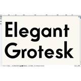
As well as running and designing typefaces for Lineto, Müller’s day job involves designing bespoke typefaces for clients including Mitsubishi, Vitra, Omega and Köln-Bonn airport. He completed a book for photographer Heidi Specker earlier this year, for which he modified 1970s typeface Unica. He designed an abstract typeface for Berlin-based artist Olaf Nicolai for an exhibition last year in Hagen, Germany, based on the layering of three simple squares per letter. And he’s finally got round to designing his own personal logo and typeface, based on a specimen from old German type foundry Stempel and renamed Elegant Grotesk.
Like all good graphic designers, his work can be controversial. Two years ago, he designed a book accompanying a lecture series in Leipzig on the theme of terrorism. He sourced actual symbols of real terrorist organisations from around the world — both official and renegade — which work individually, but also form a visual pattern, a ‘kind of terror logo carpet, where governmental and non-governmental organisations mix. Some people found that a bit cynical’.
Müller likes to stir things up. All his work is a reaction against corporate uniformity, and a bland ‘this has been graphic-designed’ look. He chooses to plunder everyday life for his work. ‘I love typefaces that haven’t been drawn by designers, but by technicians. They’re rough and honest — technicians don’t care about readability or kerning. But font libraries don’t see that, they think there’s no market for experimental typefaces,’ he says. They can be wrong. Before Lineto was launched in the early 1990s, Müller and Windlin created two pixelated fonts, Screen Matrix and Dot Matrix, which were highly experimental typefaces at the time. He was told they would never sell, but they became bestsellers with Fontshop. ‘They tuned into an emerging zeitgeist for digital-looking type,’ he says. ‘Luckily, we owned the rights.’
-
Post a comment


