The Partners warms up Chesterton’s agent image
London estate agent Chesterton is overhauling its services and brand identity following a strategic review of the company by The Partners.
London estate agent Chesterton is overhauling its services and brand identity following a strategic review of the company by The Partners.
The consultancy was appointed to the project almost a year ago and briefed initially to conduct an analysis of the strengths of the Chesterton brand (DW 20 October 2005). As part of this review, The Partners proposed a series of service innovations that aim to ‘warm up’ the buying and selling experience, says managing partner Jim Prior.
‘Estate agents in general have a terrible reputation, but Chesterton is seen as being one of the most trustworthy. We are trying to bring this out with a range of service initiatives, the use of certain language, style and staff behaviour with customers,’ says Prior.
One initiative is to draw on Chesterton’s position as one of the oldest London agents, with the appointment of staff historian Melanie Backe-Hansen to promote the heritage of its properties. Office environments will also be updated, taking cues from luxury brand retailers rather than the corporate real estate sector.
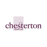
The logotype is set in an aubergine colour palette and uses the Caslon serif typeface.
‘There are a number of London agents that have a reputation for being brash about the deals and the money, and this positions the transaction as unfriendly and unemotional. We are trying to look at what people really want and to improve the experience through little things at certain moments,’ adds Prior.
Read this next

-
Post a comment


