
The Space Creative rebrands plant-based cheese alternative as a “foodie choice”
The new identity for Sheese aims to be as “accessible as possible” and includes new packaging, a redrawn wordmark and communications.
The Space Creative has rebranded plant-based cheese alternative Sheese, in a bid to mark its offering out as a “foodie choice”, rather than a “poorer substitute for real cheese”.
Made by Bute Island Foods, in a vegan creamery on the Isle of Bute off Scotland’s west coast, Sheese offers many plant-based alternatives to dairy cheeses, like Cheddar, Gouda and Edam.
Sheese has a 30-year history making dairy-free cheeses, but its shelf presence wasn’t strong enough, according to The Space Creative. The Bristol-based studio was recommended to the brand by the Marketing Place, which manages its marketing strategy. The rebrand includes a redrawn wordmark, packaging and communications.
“We kept nothing except the name”
The brief focused on “elevating” the Sheese name and improving brand visibility, according to The Space Creative founder and creative director David Thomson.
Sheese’s previous logo was “too recessive on pack”, he says, and the photography used in the old branding looked dated.
“There was a Celtic vibe to the designs that didn’t fit with the personality of the brand, so in the end, we kept nothing except the name,” Thomson says.

“Avoid overtly natural cues”
To create the visual language for the new brand, the team were inspired by “urban delicatessens”, where “handwritten signage and illustrations of food are often seen painted on walls”, Thomson says.
“We wanted the brand to look fresh and fun, and steer it away from worthy and avoid overtly natural cues like greenery and countryside scenes, because these are so often seen in the dairy-free category,” he says.
The aim, Thomson adds, was for the brand to appeal to those looking to cut down on their dairy intake and “hardcore vegans” alike.
“Cheese paraphernalia” illustrations
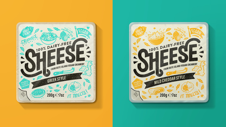
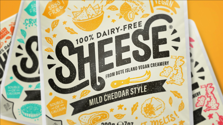
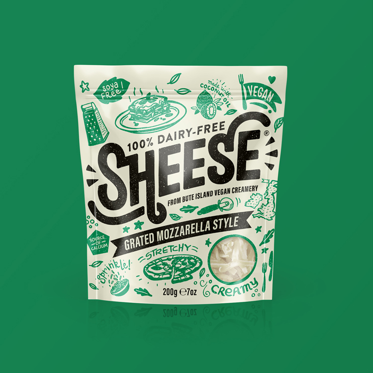
In keeping with the urban delicatessen visual reference, the new Sheese wordmark has been hand drawn. On pack, it appears in a lockup with the Sheese strapline and supporting copy: “100% Dairy Free, From Bute Island Vegan Creamery”.
It is supported by a range of hand drawn illustrations, featuring “cheese paraphernalia” like graters, slicers and cheese boards, as well as cooking utensils and recipe books.
These illustrations also feed into the brand communications created by The Space Creative, which includes marketing and social media content. The communications campaign aims to highlight the performance of the product, which is “like real cheese in that it melts, grates, stretches and bubbles”.
Achieving “sufficient differentiation”
Thomson says the main challenge of the project was creating “sufficient differentiation” between cheese variants, because of the sheer number of products on offer. This has been achieved through different colours and descriptive copy on pack.
Sheese’s mozzarella style cheese, for example, features green illustrations and copy like “stretchy” and “creamy”. Meanwhile its Greek style cheese is in blue and sports words like “crumbly”.
Another challenge Thomson says was the branding’s Europe roll out. Given the specific legalities of food labelling for vegan food vary from country to country, this is an important consideration.
Thankfully, he says The Space Creative has so far overcome these challenges without compromising on the branding.

Read this next

-
Post a comment


