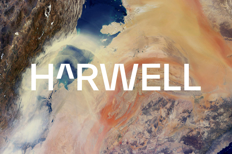
Dn&co “decodes complexities” with branding for Harwell science campus
The science and innovation campus based in Oxfordshire has adopted the new identity as it looks to expand its offering.
Dn&co has unveiled the branding for Oxfordshire-based science and innovation campus Harwell, as it looks to become the “innovation capital of the world”.
First opened 75 years ago, Harwell is home to more than £3 billion worth of national research facilities – covering areas like space, quantum computing and life sciences. An ambitious masterplan is now being rolled out to transform and expand the campus’ current offering.

“Exponential growth”
Dn&co was brought in to develop an identity for the updated Harwell, having previously had experience in life science and technology spaces like Here East, studio founding director Joy Nazzari says. The look positions the campus as a “platform that celebrates science and its unique power to unlock universal progress”, the studio says.
To underscore the importance of the science that goes on at the site, the “universal language” of mathematics has been used throughout the identity, according to Dn&co creative director Patrick Eley. He says maths “transcends discipline, age and time”, and that this approach allowed the team to outside of traditional science and tech clichés.
“We looked to the visual language of great scientific institutions but it was really important to us that design clichés such as test tubes, lasers and rockets didn’t feature,” Eley says. This includes in the wordmark, where a “caret” symbol can be found – used in maths to symbolise an exponent, such as a square or cube – the studio says this signifies the “exponential growth” predicted for the campus.
Initially, Eley reveals, the team developed a much softer typeface for the mark but he says they quick realised an “edge” was needed. “It was important to have a typeface that was more opinionated, but at the same time wasn’t the only thing someone would remember about the identity,” he says.

“Scientific computer coding without feeling straight-laced”
The caret is used elsewhere in the identity as a standalone graphic device, and also informs the typography used throughout. The typeface, the studio explains, uses a similar symmetry and “deep pinch points”. It says these visual references “evoke the rigid forms of scientific computer coding without feeling straight-laced”.
The brightly coloured palette of greens and yellows is a nod to the “vivid, energetic” nature of the campus. Finally, the “society-raising power of science” has informed the grid system which can be found across communications. Blocks increase in size to give a sense of growth and progress, the studio says.

“Decodes its complexities so they can be meaningful to many”
But while the identity is “rooted in science”, Eley says it is still “decidedly human”. “We were really keen to create a brand and identity that sat outside of the obvious science and tech references,” he says.
This desire to be human-focused drove the development of the tone of voice for Harwell. The studio explains the voice is directed by four principles: proud, provable, plain-speaking and people-focused. “We set ourselves the challenge of creating something that was intelligent, but not exclusive or elitist,” Eley says. “Our audience is incredibly smart, but we didn’t want to make something overly complex or clichéd.”
“[These] helped us uphold our lodestar belief and speak in a way that both celebrates Harwell and decodes its complexities so they can be meaningful to many,” Dn&co says.

Touchpoints
Beyond the graphic elements of the branding, the Dn&co team worked with recording studio Coda to Coda to develop an acoustic identity for Harwell. Additonally, a suite of animations has been designed too.
The brand rolls out from today across print, merchandise, signage and films and a wider campus roll-out is planned for 2022. “It’s an enabler so we wanted to create a brand that could help foster that sense of belonging and going forward we are keen to celebrate the people of Harwell and their achievements,” Eley says.

What do you think of the Harwell brand? Let us know in the comments below…
-
Post a comment


