“It’s not Robin Hood Land”: Sherwood Forest rebrands with focus on nature
The Nottinghamshire forest best known for its association with make-believe rogue and hero Robin Hood has had a revamp, with a new visitor centre, branding and wayfinding centred around environment and conservation rather than fictional characters.

Nottingham’s Sherwood Forest has been rebranded by Sheffield-based design studio Cafeteria, to show that “it’s not all about Robin Hood” and to focus more on nature and environment.
Cafeteria, which won a competitive pitch, has worked with Birmingham-based illustrator Tom Woolley on the 18-month project, and created new branding, website, print and advertising communications, a wayfinding and environmental graphics scheme found through the forest, as well as wall graphics, displays and interactive elements within Sherwood Forest’s visitor centre.
The rebrand follows the charity RSPB (Royal Society for the Protection of Birds) taking over management of the forest in the Summer of 2018 from Nottinghamshire County Council, which led to renovation of the forest and conservation work, a new visitor centre, and a new programme of visitor activities and experiences.
The new branding looks to “steer well clear of ye olde associations”, says Tom Peet, senior designer at Cafeteria, and create a “clean, contemporary” identity.
The new logo features a circular symbol, which creates an ambiguous image that appears as two different things – both the shape of a tree, made up of a leaf canopy and its roots, and a bow and arrow pointing upwards, to represent Robin Hood.
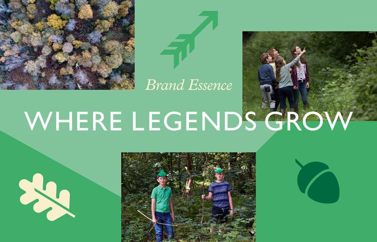
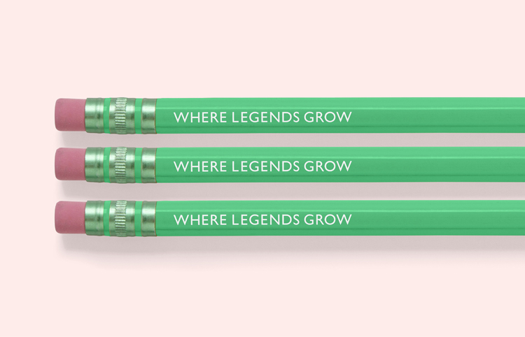
This is coupled with the name Sherwood Forest and the new strapline “Where legends grow” set in “semi-serif”, bespoke typeface, Sherwood Sans. This was based on an existing free-to-licence typeface, Fontin Sans.
“We added those accentuated serifs on the edges to add character, and make it modern but robust,” says Peet. “We call it a ‘semi-serif’ because of those inflections.
“Before, the branding for Sherwood Forest was quite dated, with the typography very ‘ye olde’,” he says. “We didn’t want to make everything clean, sans-serif, but we wanted to create character, and make a typeface that could be chiselled nicely into wood for wayfinding in the forests.”

The new logo aims to represent growth, adds Peet, with the arrow pointing upwards meant to symbolise “positivity”.
“We wanted to show that [Sherwood Forest] is a place for nature to be preserved and grow, but also a place for people to grow personally and have headspace,” he says.
“This isn’t all about Robin Hood,” he adds. “We did look at other logos with more overt references, but we didn’t want Sherwood Forest to be ‘Robin Hood Land’ or ‘Robin Hood World’, like a theme park.
“He is part of the story but that story is not fact – we wanted it to be about how you could go there and discover your own stories, and make stuff up,” he adds. “That’s why there’s no specific illustration or description of Robin in our branding.”

The new branding features a suite of abstract graphic patterns, such as leaves, feathers and arrows, used throughout communications, and a “bright” colour palette of red, green, blue, purple, yellow and brown.
The “broad” palette includes red, brown and green as they are “autumnal colours”, adds Peet, and aims to be “friendly, attractive and family-orientated”.
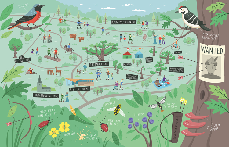
Illustrator Woolley has created a few large-scale illustrations for the visitor centre, including a wayfinding map showing specific types of trees and animals that can be found at different points in the forest.
He has also created an imaginative “life in the forest” wall display showing Robin Hood characters such as Robin and Maid Marion carrying out famous moments from stories, “mingling” with ordinary people having picnics, walking dogs and nature-watching, and with birds, insects and plants.
“It was about getting that shared DNA between the forest and Robin [Hood],” says Peet. “It looks to encourage visitors to get into the forest, explore and learn, while also taking care to look after the trees, wildlife and other people around them. What we’ve done is not as overt as having a man in a green hat.”
The new branding has rolled out on wayfinding, signage and interiors, and is currently rolling out across all touchpoints. It is part of an ongoing partnership with Sherwood Forest, which will see more assets created over time.


Shame they didn’t use the same ‘Robin Hood’ style arrow on the exterior wayfinding signage as they did on the interior. . .
Its ironic that a design studio from Sheffield was involved, given Robin Hood is always referred to as the Earl of Loxley, a suburban district of Sheffield.