Face value
Mark Delaney dreams of a time when style and usability converge. Until then, you’ll need an instruction book to use your remote
The remote control for my video has 39 buttons. I only use 15 with any sort of regularity, six on a day-to-day basis. My mobile phone has untold complexities lurking in its menu structure, many of which, it seems, are totally irrelevant to help me make a phone call or take a picture. As a product designer I feel that perhaps I should try harder to understand the full potential of these products, but as a human being, as long as I can get them to perform their primary functions, I can’t be bothered.
Product interfaces are often the key reason customers are left confused, disappointed and frustrated. But because we are surrounded by products we have become blind to their failings. We accept we can’t work out how to programme the video, because that’s the way things are. Most consumer electronics brands treat the remote control as a giveaway, so even if you are spending well over £1000 on a luxurious TV, the remote will be given the bare minimum of investment, both in manufacture and design.
In the average living room there are probably at least three remote controls, each controlling one element of your audio-visual entertainment. The design and manufacture of these will be workmanlike at best, simple black or silver mouldings, a silicon keypad and a vaguely ergonomic button layout if you are lucky. Why is the design so basic? Remote controls are the tactile elements of your product experience, the physical manifestation of the brand in your hand. So surely they should be a far more elegant, intelligent and customer-focused piece of product design?
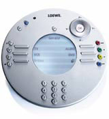
At the top end of the market, things are beginning to change. Loewe, Bang & Olufsen and Sony’s new luxury sub-brand Qualia, which launches in the UK later this year, all provide elegant remote controls which reflect the premium values of the brand and meet the needs of the user with satisfying interfaces.
The remote controls for Qualia are manufactured from tactile materials, and are stripped down to the essentials with simple, intuitive button layouts. It is a pleasure to use. Sadly, according to a Sony PR in Berlin, the remote control is only launching in Japan.
Elsewhere, Loewe’s RC1 System uses a simple circular format, which the user must cradle in two hands. The commands are configured into a clockwise solution, simply guiding the user through the interface.
Interfaces, of course, aren’t limited to remote controls. The mobile phone is already a complex piece of technology that baffles all but the most techno-literate. As we enter the 3G era, manufacturers and service providers are hell-bent on cramming even more functionality into them. We are just getting to grips with the implications of picture messaging, but soon we will be dealing with video conferencing, GPRS, broadband Internet and buddy-lists. While manufacturers have proved themselves adept at producing appealing product designs, very few have created truly intuitive and engaging interface experiences.
The style-led Nokia 7610 is one example of a mobile handset where the visual aspects of the design have overtaken the interface requirements. Sony Ericsson’s ‘megapixel’ camera phone S700, however, which comes to the UK this autumn, separates its functions into three ‘zones’: general phone use including e-mail, a 0-9 keypad and a digital camera.
Until now, interactive products have been broken down into two kinds; the engineering-led and the design-led. The former are functional products which pay little attention to the needs of the end user. They are typically found at the early iterations of a product type (think all mobile phones before 1997), where the form and function of the product are defined by the demands of immature technology and engineering. Or where manufacturers see little value in design investment – for example, most remote controls.
Design-led products dominate in mature, commoditised areas where there is little new technology to drive the market forward, so manufacturers resort to ‘radical’ styling solutions to disguise their lack of real innovation. Here the products are almost entirely driven by visual criteria, but this can often interfere with the functional elements of the product – for example, most mobile handsets.
Where the two converge is where truly radical products are being created. Take Apple Computer. It does not simply design products, it designs complete experiences that consider every element of customers’ interaction. The iPod was not the first MP3 player to market, but it was (and still is) the best because it took customers as its starting point and their need to sort and play music on the move.
We could do with a lot more ‘iPod’ thinking in the world of product design. Imagine a mobile with an intuitive interface, or a remote control designed around the buttons you actually use. This sort of simplicity requires a painstaking iterative design process which gradually reduces the options until you are left with a solution so pure and considered that it almost seems like there was no other way to do it.
Unfortunately, it will be a long time until we see that sort of rigour applied to mass market products. Most brands consider it far too time consuming and expensive, and to be honest, until their competitors do it, why bother?
Mark Delaney is a freelance product designer
Read this next

-
Post a comment


