Pop
Where Colors and Rank, both profiled here, deal in authenticity and restraint, Pop deals in artifice and excess. The magazine, produced twice a year by Emap, is brimming with the energy and fizz implied in its name. A strap line – ‘super fashion, shiny art’ – immediately spells out the magazine’s intentions.
Unusually, the first few pages of the magazine are given over to a fashion spread. But when the ads start, they’re hard to distinguish from the fashion shoot. This trend to merge advertising and editorial is a recurring theme in current magazine design. However, it’s taken to new heights in Pop, and you’re forced to ask the question: is this just a zeitgeist thing or are ad agencies and publishers deliberately trying to blur the boundaries between advertising and editorial content?
None of this stops Pop from being an exciting, high-octane read. The design, and to a certain extent the editorial policy, seem driven by three dominant influences: porn, the 1970s and the transformational power of the computer. Most of the fashion spreads contain some sort of voyeuristic element; models are trussed up or contorted into the submissive postures of a porn mag. The logo – which at first glance reads as Pap – is a foil blocked sticker and looks as if it might have appeared on a Slade or T-rex album cover. Elsewhere, it is doubtful if any of the lush fashion shoots have escaped the attentions of those ubiquitous Photoshop tools.
Pop’s design, by Lee Swillingham and Stuart Spalding, is sumptuous, and reminds me of Interview in its early days. Typographically it’s a riot, and all the better for it. Its extensive use of hand lettering (embellished by the computer) is delightful; it wouldn’t do for Perch Fishing Weekly, but it’s spot on for people who shop at Prada, or at least dream about shopping at Prada.
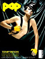
Cover credits
Art direction: Lee Swillingham and Stuart Spalding
Photography: Sølve Sundsbø
Fashion: Simon Robins
Read this next

-
Post a comment


