JKR revamp Waggledance
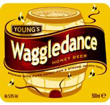
JKR has redesigned the packaging for Young’s Waggledance honey beer. The revamp increases the prominence of its unusual name ‘without alienating its Young’s heritage’. The beer takes its name from the dance of the honeybee and the packaging is designed to communicate the humour of the brand. Its label maximises the use of colour, boosts the type size and features more prominent curved lines. JKR creative director Ian Ritchie says Waggledance has a core market of both serious and experimental beer drinkers. ‘We had to communicate its individual spirit,’ he adds.
Read this next

Start the discussionStart the discussion
-
Post a comment


