Picking a nose identity
In recent years the charities sector, like any other marketplace, has grown increasingly competitive. Suzel Pitty finds out how Comic Relief ensures its brand remains a success
Be it donning pants or a bright red hooter, Friday, 16 March is Comic Relief’s Red Nose Day. And, as the UK’s highest profile charity, Comic Relief has established a brand that avoids becoming stale at all costs.
Red Nose Day has been running every two years since 1985 and, as Comic Relief’s design manager Helen Trevarthen explains, “being fresh is at the heart of our brand”.
The creative associations with which it achieves this are considerable. “We are very lucky in that we are able to draw on a wide creative resource,” explains Trevarthen, “both within Comic Relief and with friends from many different areas including artists, directors, producers, designers and people involved in all forms of media.”
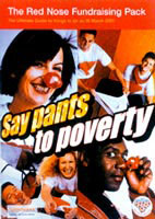
This year’s campaign carries the Pants to Poverty theme, which has been given broader application this year by Saatchi & Saatchi Design. It has produced a family of different sized fundraising brochures and posters for every audience that the charity must appeal to. As project designer Minna Orsimo elaborates, “Sainsbury’s prefers an A4 format to display in their stores, but a smaller version is more suitable for a Tube journey.” It’s trying to “balance the mass appeal with specific audiences in everything that we create,” confirms Trevarthen.
One such creation is the red nose itself, which has been redesigned this year by Aardman Animations, the maker of Wallace and Gromit. According to a company spokesman, “Comic Relief wanted the nose spruced up a bit, a new spin, and there was a resounding yes from the studio to get involved.”
The resulting Whoopee nose injects a new dimension of humour into such an established symbol of the organisation.
Taking a new spin on things offers the potential for consultancies to build upon an existing brief. Brandhouse WTS designed the packaging for the Red Nose last year, but has built on to that by combining this year’s packaging with a re-usable moneybox, designed to encourage extended donation-making (DW 9 March).
The partnership works well with Comic Relief, which revisited Brandhouse WTS for the Comic Relief co-branded chocolate bar Dubble, launched to promote fair trade involving cocoa growers in Ghana in October 2000 (DW 6 October 2000).
It seems that many companies return to Comic Relief year after year, as Lever Fabergé has branded its Persil products and donates a percentage of its profits to the charity for the second year running. Lippa Pearce Design has hijacked Persil’s existing packaging with various illustrations of underwear, and, as Lever Fabergé’s spokeswoman points out, “Persil raised £260 000 last year and the association with Comic Relief had a positive effect on our brand image and sales.”
The charity Scope was ahead of the game in terms of early recognition of the importance of design as a communication tool. In November 1994, the former Spastics Society decided to change its name with the help of Interbrand and reposition itself with a new brand identity from Fishburn Hedges.
“We tried to relate the design work into the criteria we had established about how we wanted Scope to be positioned – which is as dynamic and progressive,” explains Scope spokesman James Rye. “So we used bold type-styles and colours in a contemporary design that would endure into the future.”
As far as Scope is concerned, “design work around the new corporate identity was instrumental in shifting people’s perc-eptions at the time and since”.
In a climate that once saw design as incidental next to the need to appear transparent in its spending, things seem to be changing. “For too long there has been a certain type of ‘design for charities’ that has been depressing, amateurish and dowdy,” says Ranch Associates creative director Paul Jenkins. His findings now are far more positive: “[Ranch] has found a lively and busy climate in the charity sector, as charities now seem to realise that their image is very important.”
And the marketplace has become increasingly competitive. The National Lottery has raised the profile of the UK’s voluntary sector, but has also contributed to the appeasement of the donating public’s conscience in the buying of a weekly Lottery ticket.
“The charity marketplace has greater numbers and greater needs. It’s more important than ever that each one has a clear identity,” says Trevarthen. “Charities are now stronger, more recognisable brands.”
There are plenty of initiatives attempting to demystify design to the voluntary sector. For example, The Design Council hosts surgeries organised by The Media Trust once a month that bring together designers and charities to brainstorm. As The Media Trust’s UK manager Jo Scott points out, “Better design means more people will donate money.”
This adage is clearly demonstrated by Comic Relief, as Trevarthen concludes, “You can’t afford not to think about your image when people are bombarded every day with countless images grabbing their focus.”
This is the first year you can donate on-line to Comic Relief at www.comicrelief.com.
Read this next

-
Post a comment


