National Geographic draws from 130-year history for magazine redesign
The print edition magazine will put greater emphasis on “visual storytelling”, with more room for photography and two new typefaces that are named after historic explorers associated with the brand.

National Geographic has unveiled a new look for its print magazine, featuring more photography-led stories, several new regular front sections and two new typefaces inspired by famous figures from the publication’s history.
The magazine has been redesigned by its in-house design team led by creative director Emmet Smith in collaboration with consultancy Godfrey Dadich Partners (GDP), and coincides with its 130th anniversary this year.
The redesigned print magazine will take inspiration from its own archive, delving into its “130-year history of cartography, photography, typefaces and journalism” to create a print edition “for today”, says GDP founder and co-CEO Scott Dadich.
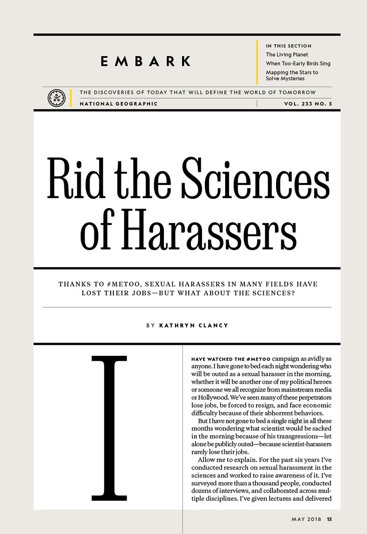
The front section of the magazine features easier-to-navigate pages that leave more space for “visual storytelling”, says GDP, and three new regular features. The Proof section will be dedicated to short photo essays, Embark will carry out investigations into new ideas, argument and theories, and Explore will feature different adventure stories each month. Additional new elements include Atlas, a story that is told in the form of maps, and Through the Lens, which will tell the story behind a single photograph.
“Instead of four or five feature stories of roughly the same length in each issue there will now be several shorter, visual features rich with illustrations and photos; two traditional-length stories with the deep, global reporting and imagery that are the magazine’s hallmark; and one major, marquee package,” says National Geographic.
GDP has collaborated with type designer Tal Lemming to create a new nameplate and two typefaces, which take inspiration from font families used by the magazine in the past.
Earle is based on Egizio Condensed, which was used as a display face by the magazine in the 1970s, and is named after National Geographic Society explorer-in-residence Sylvia Earle, who was the first female chief scientist of the US National Oceanic and Atmospheric Administration. It has been redesigned to look “less 70s”, says GDP, and “smart” as opposed to “ornamental”.
The second typeface, Marden, pays homage to adventurer and colour photography pioneer Luis Marden, who also worked as the magazine’s chief of editorial staff. It uses another 1970s typeface – Fiedler Monogothic Condensed – as its inspiration, tweaking it to look more “newsworthy” and “trustworthy”, the consultancy adds.
“From a type nerd perspective, Egyptians and Grotesques came at about the same time and were used frequently together, so there’s some history in the relationship,” says GDP. “Both faces have a distinct personality and a boldness to them – which echoes and complements the bold voice of the writing and photography within the magazine.”
The redesign comes after a successful year for the media brand’s print edition, with newsstand sales increasing by 16% in 2017. The May issue goes on sale on newsstands from 24 April 2018.


This is a really exciting departure for National Geographic! It’s always exciting when older brands revamp their branding. I also love Nat Geo’s turn toward more honesty and transparency in the wake of everything going on in 2018 – this rebrand feels in line with their “For decades, we were racist” apology.