
Pearlfisher’s “humanising” visual identity for fitness brand Body20
The design studio has used multiple exposure and motion blur in an attempt to show the human impacts of the electro-muscle stimulation technology.
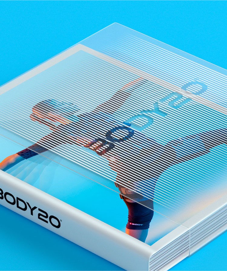
Design studio Pearlfisher has created the identity for fitness brand Body20, with visuals that aim to “humanise” the company’s technology and services.
The new work includes a wordmark, motion typography, art direction as well as packaging.

Body20 comprises an electro-muscle stimulation suit (which has been approved by the U.S. Food and Drug Administration) which co-ordinates muscle vibrations with a personalised exercise programme. As the name suggests, the regimes last 20 minutes.
The identity seeks to demystify the forward-facing technology, according to Pearlfisher VP executive creative director Hamish Campbell. “People are intrigued that Body20 distills time, but ultimately they want proof that it works,” he says.
“We looked to humanise the technology behind Body20 through our bold and telegraphic design to deliver emotional inspiration and validations rather than just explain the details of the exercise program and process,” Campbell adds.
The identity also had to stand out in what is a very competitive category, the team explains.
Amplification and vibration

According to the design team, the logo is “strong and directive”, while its custom cuts hopes to denote “technical performance and efficacy”.
The colour palette ranges from orange to blue tones which hope to reflect “the human body’s reaction during and after the workout”, the studio adds.

Two of the main focuses for the project were photography and typography, according to Pearlfisher senior designer Eric Rodriguez.
Visuals have been inspired by two real-life scenarios of the Body20 process, he explains: amplification and vibration. The first aims to demonstrate the physical movements used during the workout, while the latter is a reflection of any post-workout benefits.

The photography for amplification uses multiple exposures as a way to “illustrate progressions”, Rodriguez says. Motion blur and secondary brand colours are a way to emphasise the benefits of exercise, he explains.
The identity’s details – such as the vibrating typography and colour palette – have been rolled out to Body20’s physical locations as well. “The new brand identity scheme is a modern, energised and provocative system that opens up the world of Body20 to establish its place in leading a new future of wellness,” Rodriguez adds.

What do you think of the identity? Let us know in the comments below.
Read this next

-
Post a comment


