
This humanitarian rebrand “avoids the usual charity tropes”
Design studio Nice and Serious has given humanitarian organisation Start Network a new visual identity, based on the group’s “disruptive” thinking.
Start Network — a group of NGOs that seeks to “transform humanitarian action” — has been rebranded by London-based studio Nice and Serious.
The updated identity includes a new logo, imagery and branding guidelines. It is being rolled out across digital and physical platforms.
Start Network is a group of NGOs including Oxfam, War Child and partners like the Rockefeller Foundation, that researches and trials new ways to run aid programmes. It was originally developed and hosted by Save the Children and this year became an independent charity.
The organisation aims to reform the charitable sector by creating a “more balanced international aid system”, different funding models and better ways to share expertise.

“Positive disruption”
After talking to staff at the charity, Nice and Serious worked from the idea of Positive Disruption — the idea that Start Network could change things but also bring people along with them.
Peter Larkin, the studio’s creative director, says: “While Start Network wants to create a radical wave of disruption they also need to bring the whole humanitarian aid sector with them on this journey.”

As well as avoiding “charity tropes”, Larkin tells Design Week that another challenge was “giving the brand enough depth but also enough structure that it can be applied consistently”.
“It was important that the brand could work across a range of applications and languages, from simple signposting on the ground to complex infographics,” he adds.
Design details
Larkin says that updating the logo was part of this “disruptive” treatment. The circle icon, previously on the left of the wordmark, was included. This means that the wordmark can now “collapse into the two icons to create a shorthand, pictographic representation of the words”.
The circle icon can be overlayed on all branded material, from reports to imagery.

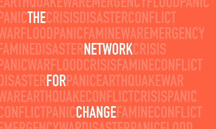
There is an emphasis on typography in the new identity and DIN Condensed was chosen as the font. According to the studio, this delivers an “impactful, snappy tone of voice”. It can be easily adapted for “calls to action”, according to Nice and Serious, which is especially important for a charitable organisation.
A “highly contrasting colour palette” was chosen. The primary shade is green, which represents the positive growth the network is bringing to the sector according to Nice and Serious. A dark blue and pastel coral were chosen as a secondary set of colours.
Devising “dynamism”
One design challenge was conveying a “disruptive” feel while also creating a cohesive look. It meant “making the disruptive elements really simple and bold,” Larkin says.
“We devised a grid structure that allows the elements on the page to overlap and give a sense of dynamism, a sort of disruption in an organised manner,” he adds.
In some of the visuals, the typography has been crossed through. “The strike-through crosses out typical industry jargon and emphasises new, dynamic ideas and intentions, while the highlight allows key messages to come to the fore,” according to the studio.
“Avoiding the usual charity tropes”
A new set of photography guidelines has also been implemented. Imagery now focuses on “people at the core of Start Network’s mission” which are “those delivering and receiving aid on the ground.”
Larkin adds: “It had to be disruptive in that it avoided the usual charity tropes and showed authentic moments of action.”
There is a “branded” green filter which can be applied to photography, which “adds a disruptive element” and also gives a “positive, fresh feeling to certain photography”.


-
Post a comment


