Mozilla’s new logo hopes to show it’s at “the heart of the internet”
The logo was designed by Johnson Banks and chosen based on public feedback, a project which aimed to demonstrate Mozilla’s advocacy for an “open and accessible” internet.
Mozilla has unveiled its new branding as a logo incorporating the “://” code used in internet urls, the result of an open-source redesign project completed with the public’s feedback.
The final design was chosen out of four shortlisted logos, which included one using the internet url signifier, one of a pixelated flame, one of a dinosaur head and one depicting several colourful bursts.
The logos were designed by consultancy Johnson Banks alongside Mozilla’s creative team, with Mozilla users offering their feedback on the designs online and at public events.

Mozilla has settled on the logo incorporating the “://” url signifier, after several rounds of research showing this as the clear favourite. It was closely followed by the dinosaur head logo, says Johnson Banks co-founder Michael Johnson.
Mozilla is a not-for-profit software company created in 1998, best known for its free internet browser Firefox. Firefox was a follow-on from previous web browser Netscape, and was one of the first publicly-accessible web browsers available.
The company also advocates for internet safety, transparency and accessibility, with all of its products available for free, such as Firefox, its Thunderbird email client, Firefox Mobile and its Bugzilla bug tracking system.
The new logo – which incorporates an essential part of a URL link – aims to emphasise that Mozilla is a “core part of the internet”, says Johnson, and emphasise that it was “at the beginning of advocacy for an open-source web”.
Zilla typeface has been used for the wordmark, a bespoke font created by Netherlands-based type foundry Typotheque. In keeping with the open-source idea, Zilla is free to use by anyone. It has been inspired by Courier, the typeface commonly used as a default for code. A black box surrounds the logo, which aims to mimic the look of text once it’s been highlighted and selected.
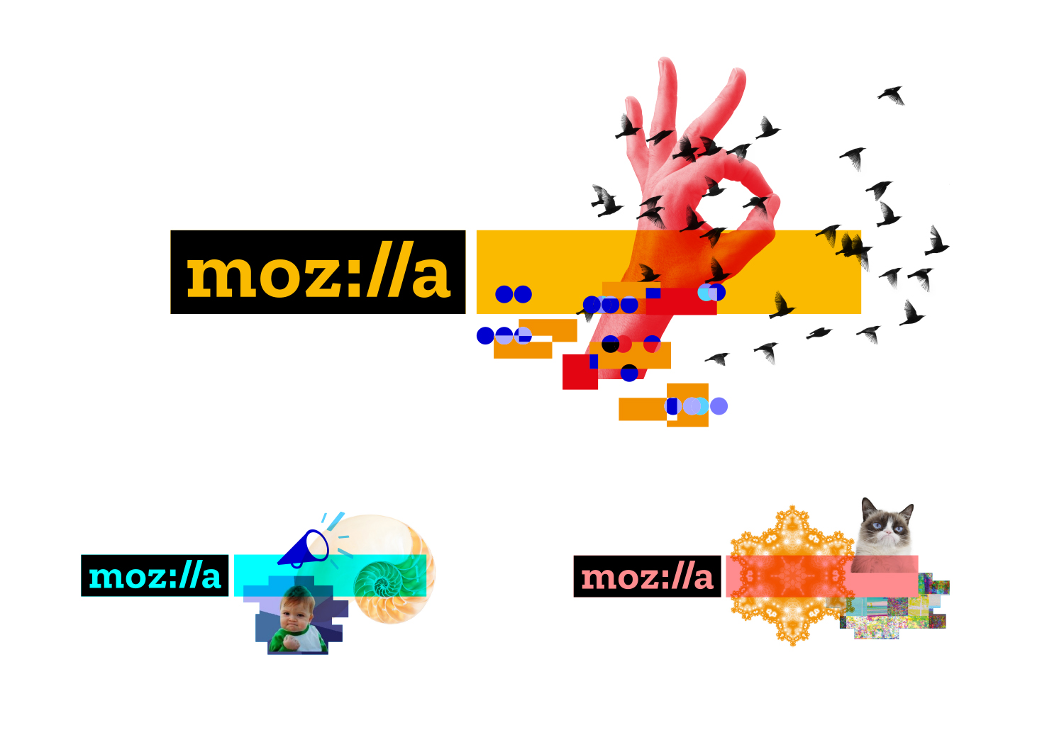
The logo is black and white as a starting point, but multi-coloured variations can be chosen for the logotype, alongside a selection of different imagery, which aims to create a personal experience for different users and allow them to “create their own identity”, says Mozilla creative director Tim Murray.

The open-source rebrand project took roughly seven months to complete. It was necessary to consult Mozilla users to “reinforce our values of transparency and participation”, says Murray – but, at first, design consultancy Johnson Banks was wary of the decision.
“Our first reaction was, ‘Are you sure?’,” says Johnson. “But as we discussed it more, we began to think, ‘What’s the worst that can happen?’. We knew we’d get trolls, everyone would have their say and it would potentially be controversial. But the general, informed audience for an organisation can have some interesting points to make and should be listened to. We learnt not to take things too personally and to grow a thick skin!”

He adds that the project was an example of a more contemporary way of thinking about design. “The traditional thing of a graphic designer presenting their work and everyone saying ‘Oh my God, that’s genius’ is an old-school thing,” he says. “It just isn’t like that anymore.”
The runner-up dinosaur logo is an adaptation of Mozilla’s original logo, but was felt to convey a less serious tone, says Johnson.
“Mozilla really wanted to look professional and grown-up about what they do,” says Johnson. “It didn’t say ‘We are at the heart of the internet’ or ‘We have been here for decades’.”
The new visual identity starts rolling out today online, and will continue to roll out over the coming months for conferences, initiatives and campaigns worldwide.


Read this next


Seems ridiculous to brand an internet company with colons and forward slashes when people might try and type them into a search and not get any results.
Clever idea, not very forward thinking though. I get the meaning behind accessible internet but the http:// isn’t really a requirement or even seen on some web browsers nowadays and especially as people are dropping the www. too.
It also looks like a confused or angry emoji : /
I fear this idea is 10 years too late
what an ugly result from a poorly advised process.
hopefully this unpleasant outcome will put people off the idea of publicly run branding endeavours for good.