New Abbey Road identity takes inspiration from Beatles record sleeve

Form has created a new identity for London recording studio Abbey Road, which takes its inspiration from the cover of the Beatles’ Abbey Road LP.
Form partners Paula Benson and Paul West worked together on the project. They say: “It is impossible to separate the connection between the Beatles and the Studios… The album’s cover features the new iconic shot of the band on the zebra crossing outside the studios. Google ‘Abbey Road’ images and it pops up on your screen, repeated hundreds of times.”
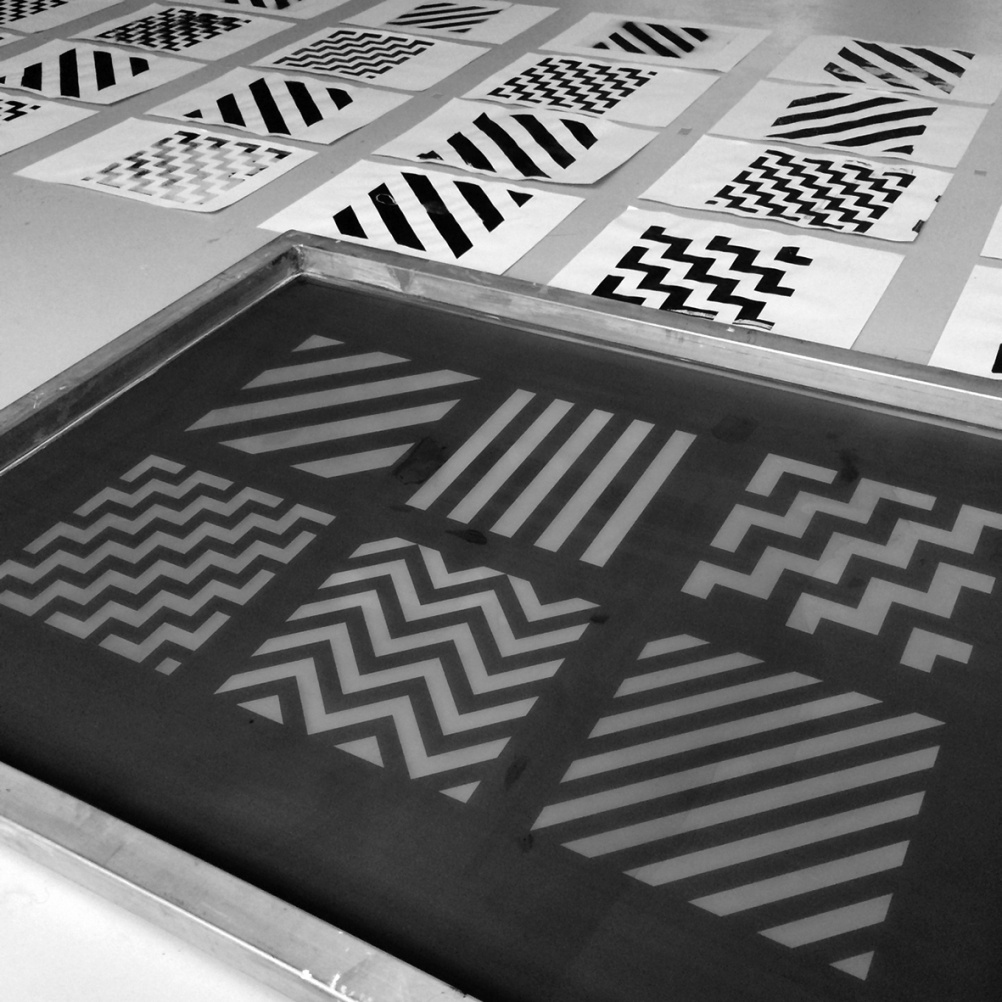
Form adds: “Rather than ignore the crossing’s black and white stripes, we decided to deconstruct and reimagine it to celebrate a new era for Abbey Road.”
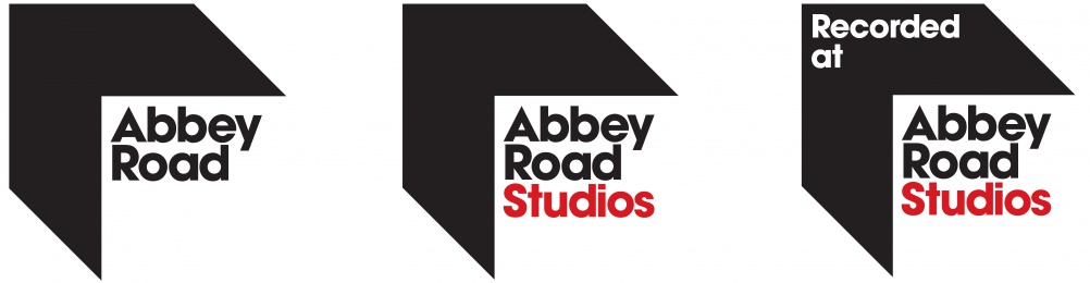
The new identity is based around chevron which Form says is formed from “one black stripe moving across a three-dimensional plane”.
The stripe points to the upper left, or “north-west” as a reference to Abbey Road’s location in north-west London. It also reference the parquet flooring found throughout the studio, according to Form.
As well as being used with the Abbey Road wordmark, the chevron device will also be used as a container for other still and moving images.
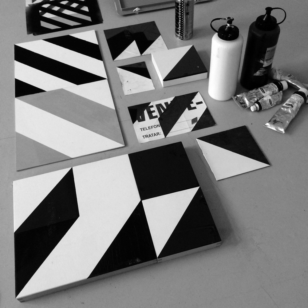
Form has also worked with artist Patrick Thomas to create a new series of graphics and patterns for Abbey Road as part of the visual identity. These “reimagine” the black-and-white zebra crossing stripes and also use a new red sub-brand colour.
Form says that these graphics will be used on brand collateral for Abbey Road, as well as a planned forthcoming range of consumer-facing merchandise. The consultancy says: “The slightly painterly, handcrafted works hint at the craft ethic that underlines all that happens at Abbey Road.”
Form was commissioned to work on the rebrand in 2014 and tasked to develop an identity that would cover all the elements at Abbey Road. As well as the studio, Abbey Road also provides audio products and online mixing and mastering services.
The new brand sees “Abbey Road” turned into a parent brand and separated from “Abbey Road Studios”. Other sub-brands in the system include new education wing “Abbey Road Institute”.
The new identity is rolling out from this week.


Blimey that’s dull. Looks like a cheap radio station.
Love the patterns, not so keen on the type used in the logo. Also in my personal opinion, I’m not sure relying on a previous era truly heralds the dawn of a new one? Isn’t time the whole Beatles thing was put to bed? Don’t get me wrong, they did a lot for popular music but it’s all getting a bit retro. No wonder so many up and coming bands imitate them.