Wolff Olins refreshes Orange visual identity
Wolff Olins has worked on the new visual elements and brand strategy for the phone company, which looks to humanise the brand. The global rollout excludes the UK, where the Orange brand is now EE.
![ORA_B2C_frames_FR[6]](https://s3.eu-central-1.amazonaws.com/centaur-wp/designweek/prod/content/uploads/2015/03/ORA_B2C_frames_FR6-1002x564.jpg)
Wolff Olins has completed a visual identity refresh for phone company Orange, 20 years after designing the original brand.
The global brand refresh has been applied to all 29 countries that Orange operates in, excluding the UK, where the high-street brand is now EE.
The consultancy has worked on a new brand strategy alongside the visual expression – Essentials 2020 – which looks at enhancing the “human touch” of Orange, and making the company an integral part of customers’ lives, Wolff Olins creative director Neil Cummings says.
“We’re helping Orange to be an essential part of everyone’s life,” he says. “More than just a supplier of handsets and mobile networks.”
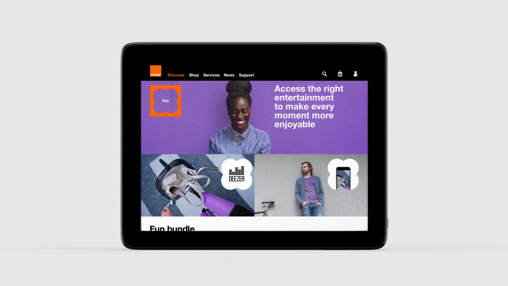
The new visual expression sees the inclusion of six “essential life themes” represented by image frames, which are at the “heart of the new design”, Cummings says.
Each frame holds text that shows insight into what’s essential for a customer, and has a corresponding “pop-out” counter-shape, representing the product or service category that Orange would respond with to help them.
“Frames show Orange is listening to what matters most with customers, then pop-outs show how the brand responds with what’s essential to them,” Cummings says.
He adds: “For example, the home shape would be used when Orange is talking about how it is essential in the context of home. The product would then match whatever customer need has been highlighted – this could be the latest ‘Home Live’ technology, a television content offer or fibre optic broadband.”
The colour palette – previously orange, black, grey and white – has also been expanded with five new supporting colours, and photography and illustration has also been revamped to add to the “warm, human tone”, Cummings says.
The Orange logo remains unchanged. “It still has the strength and simplicity that it had when we designed it 20 years ago,” Cummings says.
“The Orange brand has been increasingly stretched as they’ve grown their footprint and product portfolio,” Cummings says. “We’re reinvigorating the brand and experience, helping it tune into what’s essential for its customers.”
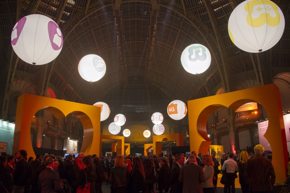
The corporate strategy launched this week at the Grand Palais in Paris, where the interiors were turned into an interactive space.
Visitors were invited to walk between the six central themes, which had been extended to 25 foot high, and explore each area looking at different aspects of the business.
“It was both an exploration of the future and a fun event allowing people to get engaged in what the brand is about,” Cumming says.
The customer-facing strategy will be rolled out over the next few months.
![Orange-Paris-Screenshot[2]](https://s3.eu-central-1.amazonaws.com/centaur-wp/designweek/prod/content/uploads/2015/03/Orange-Paris-Screenshot2-1002x563.jpg)


Read this next


So WO have taken some common shapes and cut holes out of them then and charged Orange about £2m for the privilege I suspect. Nice work if you can get it! 🙂 Not the most creative thing WO have ever done I feel or am I missing something here?…
@Grenville Tanner Welcome to the world of large branding consultancies. They often come up with really simple designs (which aren’t necessarily bad in their own right of course) but then swamp the client with brand strategy and bollocks about marketing and the state of the human race and then manage to charge a ridiculous amount of money.
I think the bigger question is who are Orange? There’s a real sense of confusion around Orange’s relationship with EE. With EE the replacing their stores in the high street there’s no sense of hierarchy or independence.
The designer seems to be a total washout. The design is unbelievable ugly. Looks like the work of someone who got no design skills and no sense of creativity at all. A design student in the first year or even first month would come up with better work! One of the worst brandings I’ve ever seen.