
Plumstead Centre’s “bookish” identity celebrates its literary heritage
Originally builty in the early 19th century as a library, the Greenwich-based centre is now also a café, gym and social space for the community.
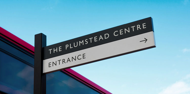
The Plumstead Centre, located in the London borough of Greenwich, has been given a new visual identity by SEA studio.
The London-based studio is responsible for the centre’s identity, exterior and interior signage as well as a wayfinding system.
It has been unveiled with the reopening of the building, which was recently refurbished by architects Hawkins\Brown. The centre, which was originally a library, has been diversified. It is now also a café and gym and social space for the community.
The library was built in 1903 and is one of the Carnegie-funded libraries, a library built with money donated by Scottish-American businessman Andrew Carnegie.
A “simple” typographical approach

Bryan Edmondson, creative director of SEA, tells Design Week that the ambition for the project’s legacy was based around “community”. He adds that it will hopefully “kickstart” other projects around Greenwich.
As a project, Edmondson says it was a “visual gift” as it combines typography and the rich history of a library. As it is a grade-II listed building, however, the studio didn’t want it to seem like “too much of a history lesson”. It was about taking a “reference of the typographic history” but making it “contemporary”.
As “everyone in the area knows the building”, identification was not a driving force behind the new branding. The identity did however have to unite the new services – “libraries survive in different ways now”, Edmondson adds – while keeping the library at its “heart”.

Gill Sans, the font that is used for Penguin Books, was chosen for its “bookish” references. “We chose a fairly obvious typeface, that fit with the period, and treated it in a contemporary way,” he adds.
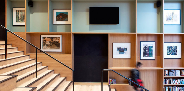
This is a starting point for the entire identity. All the visual language was “simply derived from books”. The internal signage system, for example, is based on the image of “books that have been stacked on top of each other”.
Getting the public’s attention
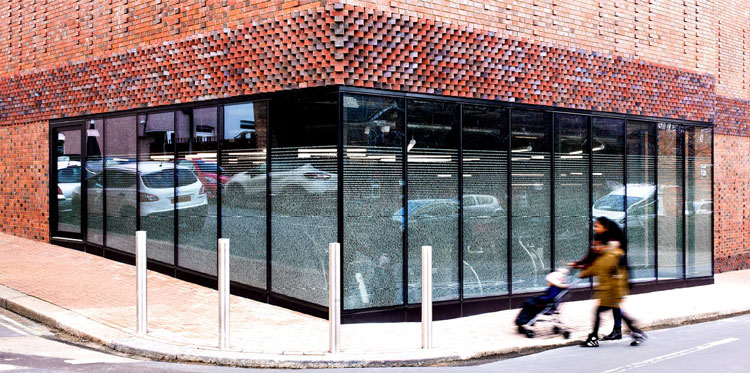
The words on the window, which the studio is calling “manifestations”, are all from local schoolchildren about what libraries mean to them. As well as engaging the community, this was also an effort to engage young people with reading, accessing libraries and “experience the physicality of reading a book”, Edmondson says.
This text is also written in Gill Sans, and has been printed out on vinyl which is applied to the windows around the gym. The lines of text are narrower at the bottom than the top, which also provides privacy for those on the inside of the building. The spacing also allows for a “vignette of light” to enter from the top and travel through the building.

Although there are no plans to, that means that the text could be changed at a later date.
As well as highlighting the community spirit of the centre, this display also aims to draw people in, according to Edmondson. ‘Like the brickwork from Hawkins\Brown, it tries to grab your attention, while not being too brash,” he says. The footfall around the windows is “immense”, he adds.
“Neutral” design details
This applies to rest of the identity, with the colours kept as “neutral as possible” and the materials are synthetic.
While the identity is mostly black and neutral, there is a pale pistachio shade used in some of the signage, which gives the identity a “flash of colour” without being too distracting.
This tone was picked from an old colour system used in the original library building. “We thought we’d take one of those, pare it down, and make it a little bit cooler,” Edmondson says. That shade has also been used in some of the interior paintwork.
The icons – for the café, gym and toilets, for example – has been kept relatively minimal. “We tried to create one set of simply icons that weren’t overly expressive,” Edmondson adds.
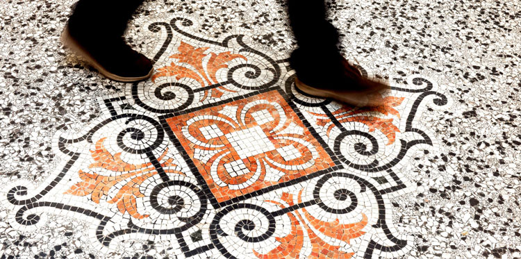
The simple design approach works alongside certain elements of the heritage building, such as the floor mosaic, according to the designer.

-
Post a comment


