Totalcontent’s new identity features a “cornucopia of quotation marks”
Supple Studio has designed the copywriting company’s new branding, which incorporates quote marks in a mixture of classic and contemporary typefaces.

Founded in 1993 by former Design Week columnist Jim Davies, Totalcontent works on copywriting projects for a wide variety of design consultancies, media companies and big brands. Its client list ranges from the Design Council and Brand Union to Unilever and Royal Mail.
Following Supple Studio’s redesign of Totalcontent’s website in 2014, the Bath-based consultancy was commissioned to create a new identity for the copywriter.
The new branding takes inspiration from the company’s previous identity designed by NB Studio in 2007, and retains fluoro orange as its main colour as a nod to Davies’ Dutch roots.
“More singular idea”
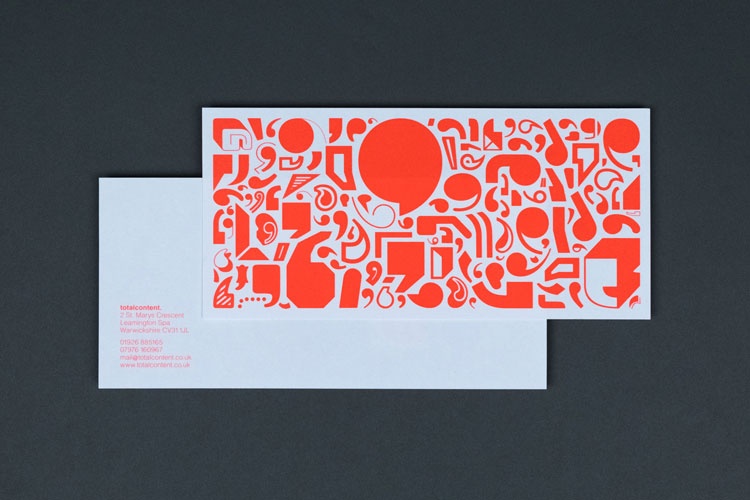
While the old branding saw an abstract pattern of letterforms based around wood block type, the new design incorporates a “cornucopia of quotation marks” that suggest a dialogue between words and design, says Supple Studio founder Jamie Ellul.
“We loved what NB Studio had done all those years ago and wanted to keep the same approach, but ring the changes by using quote marks as a more singular idea,” Ellul adds.
The studio used a combination of classic typefaces such as Caslon, Bodoni, Garamond and Helvetica, along with some more modern ones. Ellul says: “We wanted to get all the classic types in there to reference design history but mix in some more contemporary faces to reflect the diversity of projects Totalcontent works on.”
Totalcontent’s new identity has now rolled out across all touchpoints.


“There are three responses to a piece of design – yes, no, and WOW! “. Milton Glaser.
My mum likes Milton.
Perfectly captures what we’re all about, couldn’t be more happy with it.