Clear identity for Exxon Mobil gas
The revamped corporate identity for Exxon Mobil’s business gas arm, designed by Clear, launches this week.
Clear was awarded the project in April, following a three-way creative pitch against undisclosed rivals. The total fee is understood to run to six figures.
The identity is based on a leaf motif but retains the original ‘the natural choice’ strapline and Exxon Mobil’s group livery, created by New York-based Lippincott & Margulies, which was rolled out in January 2000 (DW 7 December 2000).
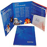
Customer packs, which include meter-reading booklets, emergency information sheets and direct debit forms, using the new logo will be sent out to new and existing customers next week . The logo will be rolled out more widely on promotional materials over the coming months.
The brief, according to Clear managing director Myles Poulton, was to update and soften the company’s corporate image, in response to a market that has become increasingly competitive since it was deregulated across the UK between November 1997 and June 1998.
Poulton says, ‘Its literature had been stereotypical, people don’t need pictures of oil rigs to know where the gas comes from. They want to know that the service is good.’
The leaf image serves to emphasise the organic associations of the product, and the teamwork and service element of Mobil’s corporate culture through the leaf’s vein pattern.
-
Post a comment


