Way out West
Just one year old, San Francisco consultancy Method has already impressed some important clients. The outfit has set its sights high and aims to redesign the visual language of the Web.
Who’d have thought… One minute you’re a cog in the machine of a renowned (read, safe) international design consultancy wishing that something would give. Then, after a fair number of kitchen table discussions, you’ve set up shop with a gang of equally disgruntled peers. Today, less than a year later, you employ more than 30 mates, are looking for larger premises and have produced a folio of cutting-edge, multidisciplinary projects for an impressive list of up and coming media brands, aka the blue-chip clients of tomorrow. Not bad eh?
And what is this design-industry version of Miracle Grow? Method consists of partners Kevin Farnham, Mike Abbink, Patrick Newbery and David Lipkin, all of whom previously worked at MetaDesign’s San Francisco office. Method’s staff is predominantly made up of ex-MetaDesign colleagues with an average age of 28. This makes for a studio atmosphere that is more family than formal, which, in the land where corporate culture rules, makes for an instantly fresh approach. Method has also enticed friends of friends over from Europe (Austrians, Swiss, Swedes) simply because the founders like their design attitude. The thinking is that having a bunch of “foreigners” on board provides this new venture with a tangible advantage over more mainstream, home-grown US consultancies, especially in the eyes of an increasingly global clientele.
That international slant may be unusual in the US, but the fact that this success story has a San Francisco backdrop shouldn’t come as any surprise. It’s official – the city is experiencing a boom fuelled by the media and software industries, with e-commerce, broadband netcasting and wireless communications being slated as the next big bonanzas. It’s obvious design has a crucial role to play in the realisation and dissemination of these industries. And, with clients eager to launch themselves on to digital media platforms and to appeal to more discerning audiences, they also seem willing to stick their necks out and go with a design group that does things a wee bit different from the norm.
In a boom situation it’s all too easy to adopt a “give them what they want” attitude. But that’s not Method’s style. One of the founders’ reasons for going it alone was to do it their way – a radically-refined version of Swiss Modernism. For what better way to deal with the Internet’s information overload than to impose a grid on it? And considering Method boasts a mature understanding of digital media and technologies, thanks to a history of collaboration with the best of Silicon Valley’s back-end service providers, its aim to re-design the visual language of the Web doesn’t seem so far-fetched.
Farnham, Method’s chief executive officer and previously MetaDesign’s director of Web development, has been involved with the commercial Internet business since its mid-1990s infancy. Pre-MetaDesign, Farnham was at Organic Online, where he designed Yahoo!’s identity back when most of us didn’t know a search engine from the Thomas the Tank kind. And Farnham isn’t the only Method staffer who knows what to do with a mouse. After being an interactive designer and project manager at MetaDesign, Newbery became production director at Fitch in Boston, then Ernst & Young’s senior manager for the national e-commerce audit and advisory business service unit. Meanwhile, Lipkin began at Scios Consulting designing networks and systems for businesses, then spent ten years with MetaDesign before becoming director of technology and management. These guys aren’t amateurs.
On a bright January day, which is atypical for foggy old San Francisco, three members of Method – Farnham, Abbink and project manager Cameron Campbell – sit down to describe their approach. Farnham explains how “right place, right time” applies to this new venture: “We are interested in building brands across all media. The market is perfect for us right now because clients which have tons of information which they need to cram into a tiny screen-sized space want someone who can deal with it in a smart way, so it makes sense to put a grid and some logic to it. They like our simplicity and order because there’s so much screen-based crap out there.”
While still at MetaDesign, Abbink, Method’s creative director, redesigned Apple’s corporate stationery, along with a new version of its Garamond typeface. His own typeface, Kievit, is being published by FontShop International. Abbink is in love with the design elements traditionally monopolised by print – type, colour and the grid – but isn’t phased by the need to export such Modernist design sensibilities across all media, from paper to the digital realm. “We’re all about systematising design, not turning it into a style, but instead creating a kind of method,” explains Abbink. Realising a design approach with visual flair and organisational integrity is what Method is all about.
Was there a mass-exodus from MetaDesign San Francisco? When Abbink and Farnham are pressed to respond to the question they are diplomatic, but at the same time they don’t pull any punches. “We all left at different times for various reasons,” explains Farnham. “I’d actually been freelancing at MetaDesign for a while,” he continues, “but when a client, Autodesk, asked me to set up a team to work on Autodesk.com, to combat the perception that it is just a CAD company, that was a pretty compelling scenario for starting a studio.” Six months later, Method had completed the mammoth task, streamlining Autodesk.com’s 10 000 pages and 150 links down to the clearest interface and easiest navigation route. “On the homepage you’re two clicks away from getting the exact info you need,” says Farnham.
He continues: “My personal reasons for leaving MetaDesign were mostly due to their resistance to technology. I struggled, as the first Web designer in what was then a print-based office. Now more than 85 per cent of its business is Web-based. Knowing how technology is going towards broadband and handheld devices, I didn’t want to fight that fight all over again.”
“MetaDesign had just got comfortable doing mainstream Web design,” explains Abbink, “but Kevin and some of us wanted to keep going further. Myself and others who had just left MetaDesign previously worked on the Autodesk account, so when it said to Kevin, get a team together, it all just fell into place.”
“It’s an odd time for MetaDesign,” remarks Farnham, proof being the London office’s split – since early 2000 the ex-Giant, ex-MetaDesign studio has been allied with the global digital design company, Icon. MetaDesign’s three studios, however, have always run as separate businesses, so the fallout from such a re-shuffle shouldn’t be too disastrous for those left behind. Consequently, though, the joins were never seamless. Abbink continues: “For us, not only was technology an issue, but each city (Berlin, San Francisco, London) had its own approach. They overlapped, but there are differences and over time their paths diverged.
“I think San Francisco is the most different. MetaDesign’s work in the US is more consumer-oriented, it’s easier to sell. They’re into generating cashflow and to do that they take more consumer and corporate jobs. Now, with Method, we’re small enough and young enough so that we can stand behind certain beliefs.”
“But we still have such a connection to MetaDesign,” explains Campbell, who worked for MetaDesign in London and San Francisco. “It’s like we’re the children. We grew up and had to leave home, but we all learnt so much… In a way, we’ve stayed close to the original idea that Erik Spiekermann had for MetaDesign,” adds Abbink. “Erik always pops in when he’s in town – we’ve got a good connection with him.”
So, since last February, Method has been putting that original, problem-solving, information-led approach to work. With word of mouth as its sole marketing tool, you’d think Method’s clients would all come from the same industry and be asking for one thing: Internet. “Surprisingly,” says Farnham, “they’re not all Internet start-up companies. People want us to design their website, so we do a pitch. When they see that we can supply the whole package, they say, let’s back up and start with a brand strategy then. There’s not many firms that can do a solid identity and translate it into all these different media – the handheld device, cellphone, website, applications, templates, interfaces, stationery, brochures etc. We work with back-end partners, but we’ve been doing this long enough to understand the constraints. We’ve even got a sound designer.”
Scroll through a few of Method’s projects and you’ll see subtle design sensibilities married to no-nonsense, technical expertise. Thinking outside the box for the fashion magazine/ e-commerce portal www.style365.com, it has solved the most obvious problem to plague commercial websites. Instead of running ads as the usual banner, Method designed a grid discretely incorporating magazine-format ads within the site’s pages, allowing fashion advertisers to re-purpose costly campaigns across media. Simple, ingenious, obvious even, and crucial to the success of an advertising-hungry fashion site, but, Farnham reiterates, “It’s the first time I’ve seen it done in an interactive space.”
Another fashion-related client, Tradeweave, needed a Web-based interface by which its members – hundreds of retailers, wholesalers and manufacturers – could communicate in a real-time auction of fashion goods. Method needed to understand Tradeweave’s business in detail before designing what is its primary infrastructure, and spent a lot of time discussing processes and etiquette with the traders. Farnham explains, “Say I’m Macys, Saks or whoever, and I’ve got 400 DKNY dresses to sell, I put them up for auction on the site, but because DKNY doesn’t want to be sold in certain stores, we had to make sure all those issues were sewn up.” And, as this site would be open on the desktop for the entire working day, the visual solution needed to be clear and ordered. Hence, info is as strictly regulated as a Swiss railway timetable, but dressed in a limited but coded palette of screen/ vision-friendly colours.
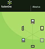
Digital media company FusionOne was so happy with Method’s explanatory website that it was used as the primary marketing tool at the company’s launch during Las Vegas’s Consumer Electronics Show, explaining the “Internet Sync” service to the bemused public. Initially brought in just for the website, Method ended up doing “everything, including the icons”. FusionOne provides a service for users to synchronise software between various devices. Enter data on your office computer and it automatically updates your terminal at home, your electronic note-pad, mobile phone, and so on. No more valuable contacts lost on scraps of paper. Farnham says: “We wanted to illustrate how the service works, as it’s kind of complex for newbies to understand, so we take you into an interactive demo. We also designed sound branding – distinguishable noises for the synchronisation between various devices.”
They may be high on jargon, but you can put that down to “cultural difference”, as the Method team isn’t all talk. Within a year it has impressed some serious clients and made its mark on San Francisco’s booming design scene. Bravely, it is attempting the unenviable task of re-introducing the fundamentals of good design and brand integrity to corporate America by way of the most unlikely tools, but the ones we’ve been warned to ignore at our peril – the Internet and all its digital off-spring. How it progresses should prove interesting.
systems project
Method’s chief executive officer Kevin Farnham recalls a project for Adobe Systems. ‘Adobe came to us with two domain names, www.defytherules.com and www.smashstatusquo.com, which were backed by a $10m (£6.3m) ad campaign created by Young & Rubicam and shown in 13 countries.
‘They wanted us to build sites using the ads’ imagery [simultaneously] demonstrating their muscle in the Web design area by featuring their softwares. Basically, they wanted two different demo tools. But it took a bit of back and forth before we believed that, “Wow, this is Adobe giving us an open slate and they’re serious.” Then they gave us about eight weeks to do it in.
‘We decided not to work with any back-end providers, but to do everything in-house with Adobe’s tools. Once loaded the sites are “all there”, no need for plug-ins.
‘So, we created two interactive narratives. Defytherules shows how the site was built and what the applications can do for you. We used the applications as metaphors, incorporating elements from the interfaces into the design, taking step-by-step screenshots of the process of using Illustrator, Photoshop, After Effects, Premier and QuickTime. Then we used Go Live to produce the website.
‘With smashstatusquo, we took a more radical approach and made the website’s virtual world actually extend beyond the screen’s window, so you can slide beyond into different areas. Once you’re in a world you roll over the icons to find the contents. This site also demonstrates what the programs can do as each world has a different graphic look.
‘We were really surprised that Adobe, the third largest software company in the world, came to us and said, “Do whatever you want.” The sites have been up since October 1999 and the feedback has been phenomenal, with comments like, “You can’t do that with this software!” and “It’s the best use of the Web we’ve seen!”‘
-
Post a comment


