Living legacy

As a major retrospective of the late Alan Fletcher’s innovative and playful work opens at London’s Design Museum, Yolanda Zappaterra talks to some of today’s design students about what he means to them
Last month, Naresh Ramchandani wrote a compelling piece in the Media Guardian, pointing out why the current Sony Bravia ad, despite being technically as brilliant as (if not more than) its bouncing balls down the sunny streets of San Francisco predecessor, isn’t as good as that first ad. To paraphrase, where Balls had a humanity that made you smile, Paint is a piece of excellence that makes you admire, but not fall in love with, the product.
The piece made me think about Alan Fletcher and why he was such a great designer. People fall in love with Fletcher’s work on first sight, initially for the immediacy of the humour, but ultimately for its warmth and humanity. That distinctive handwriting and his lifelong use of graphic ephemera always made you think of the hand in the creative process and the very human aspects of the piece, whether it was the person behind the work, the personality of the brand that the client wanted Fletcher to bring out, or the audiences that would see that work. But what do the designers of tomorrow make of the whimsy, delight and sheer playfulness of Fletcher’s work?
Paul John-Baptiste
Research associate, The Helen Hamlyn Research Centre, Royal College of Art
‘Fortunately for me, I was assigned Alan Fletcher in an early college brief. From the moment I set eyes on his work I was enamoured by the simplicity and elegance of his solutions. He stripped away all pretension and got straight to the heart of the matter. As a designer his work doesn’t just appeal to other designers, it reaches out to a mass audience. But above all, he makes me laugh. My favourite piece of his work is featured on page 167 of his book Beware Wet Paint. It is such a simple solution, which to me typifies Fletcher’s way of working – using found objects as a source of inspiration. In the end, we are judged on our actions and the contribution we make. Through his work Fletcher made a profound impact.’
Jessica Gahan and Matt Busher
Graphic design students, London College of Communication
‘The piece that really stands out for me is The Victoria & Albert Museum logo. When I started to learn about visual identity I felt it shone out as an example of what every logo should be – simple enough to just glance at, yet with a twist that makes it interesting and clever. It’s recognisable and memorable and its look reflects the organisation it represents. Most importantly, it has longevity and wit. The way Alan Fletcher saw the world and paid attention to it has inspired the way I work. I don’t divide my life between labour and pleasure, and I’m constantly looking sideways!’ says Jessica Gahan. Matt Busher describes the V&A logo as ‘a clever idea with Fletcher’s customary wit and warmth. His enthusiasm for being interested in “things”, for making “things”, has influenced my thinking, even if I haven’t been completely aware of it at the time. I suppose that’s what you could call his legacy – enthusiasm.’
Stephen Plaster and Maya Stigner
Graphic design students, De Montfort University
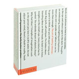
‘My favourite piece by Alan Fletcher is the book The Art of Looking Sideways (pictured right), recommended to me by my tutor, typographer Paul Linnel. I took an instant liking to Fletcher’s free spirit. His childlike attitude towards design is epitomised by the handwritten word “Play” on the inside of the book cover. Judging by this book, his mentality was that of a design schizophrenic, constantly churning out ideas, concepts, witty anecdotes, and illustrations, and treating it all as a second language,’ says Stephen Plaster. Maya Stigner concurs. ‘The Art of Looking Sideways has been very inspirational to me, I dip into it constantly to see Fletcher’s view of the world’, she says. ‘I use this inspiration as a tool to focus with when I’m working. His vast bank of knowledge and showing of interest in every little thing would be an inspiration to anyone to think outside the box and look closer at the detail.’
Rebecca Drew
Graphic design (advertising) student, London College of Communication
‘The Pirelli slippers advertisement (pictured below left) of 1962 caught my attention the first time I saw it. I love the simplicity of the clever art direction, a fantastic example of how simple advertising is usually the most effective. But it was also Alan Fletcher’s playful, innovative thinking that was so great. Always thinking outside the expected, surprising his audience with something new and exciting throughout his career. I would like to think that his free, fun style of working has influenced how I tackle my own briefs.’
Daniel Chehade
Typography and graphic design student, London College of Communication
‘Alan Fletcher has made a huge impact on the way I work, or more precisely the way I think. Literally looking at things sideways, squeezing ideas down to their essence and most importantly living by design. It’s unfair for me to pick one piece of his work that strikes me as being brilliant, challenging or innovative, but at a push I’ll say the calendar Unreliable seasonal predictions. It demonstrates his vast knowledge of materials and his incomparable ability to control and manipulate them, as only he could.’ l
The exhibition Alan Fletcher: Fifty Years of Graphic Work (and Play) continues at the Design Museum, Shad Thames, London SE1 until 18 February 2007
Alan Fletcher: Picturing and Poeting is published by Phaidon Press, price £24.95
Read this next

-
Post a comment


